Showing posts with label monarchy. Show all posts

Wednesday, January 12, 2011

monarchy & vpro continued 3 (art in our merchant society, more digital design)

[oh well, i probably should have added what follows next to the previous post, but it would have become so terribly long.]

one thing certainly strikes me: last year's theme `the monarchy' certainly struck home a lot more than this year's theme `ode to paper'. in fact, looking at the designs which were pitched, the first thing that glares at us is that so many of last year's designs were so negative about our royal family. so let me make a small leap of imagination here.

first of all, last year the vpro chose as winner a non-committal design, bland even, which did not relate a lot to the briefing, but which did have the decided advantage that it would not give negative publicity (one must remember that the royal family still has the support of well over 80% of the population - incredible but true.). looking at the submitted designs, there were obviously enough excellent designs that -if made vpro cover- would have led to a lot of commotion under vpro members, and possibly non-members too.

so could it be that in our merchant society, the vpro hesitates to use covers which are really confrontational, which really touch on the societal issues at hand? i would not be surprised if the vpro was surprised last year by the vehemence of the designs offered. so that might explain the rather bland theme this year: `ode to paper'. no way that there will be controversial designs coming out of that theme!

ok, sorry for bitching, but it still is a fundamental issue: why would the vpro not be happy with the real societal response they had with the theme `monarchy'? is that not truly fantastic, if you can mobilize people's visual creativity around current societal debates? [ongoing, in case of the monarchy, for this great institution costs our society 114 million euros a year...if you can believe that in a time where we are budget-cutting hospitals, care centers, schools etc.].

so once more i hope the vpro will take the stance that controversy is better than blandness. we do not need blandness in this society which is sorely late for some real refurbishing. we do not need more bland television, more entertainment, empty amusement. we need sharp criticism of banking institutions, of greed, corruption, of discrimination etc. etc. IF we are ever to do better than our predecessors who made such a mess of things.

&&&&&&&&

ok, then i still owe you my design for last year:

design frank waaldijk, VPRO Gids Cover 1, 2010
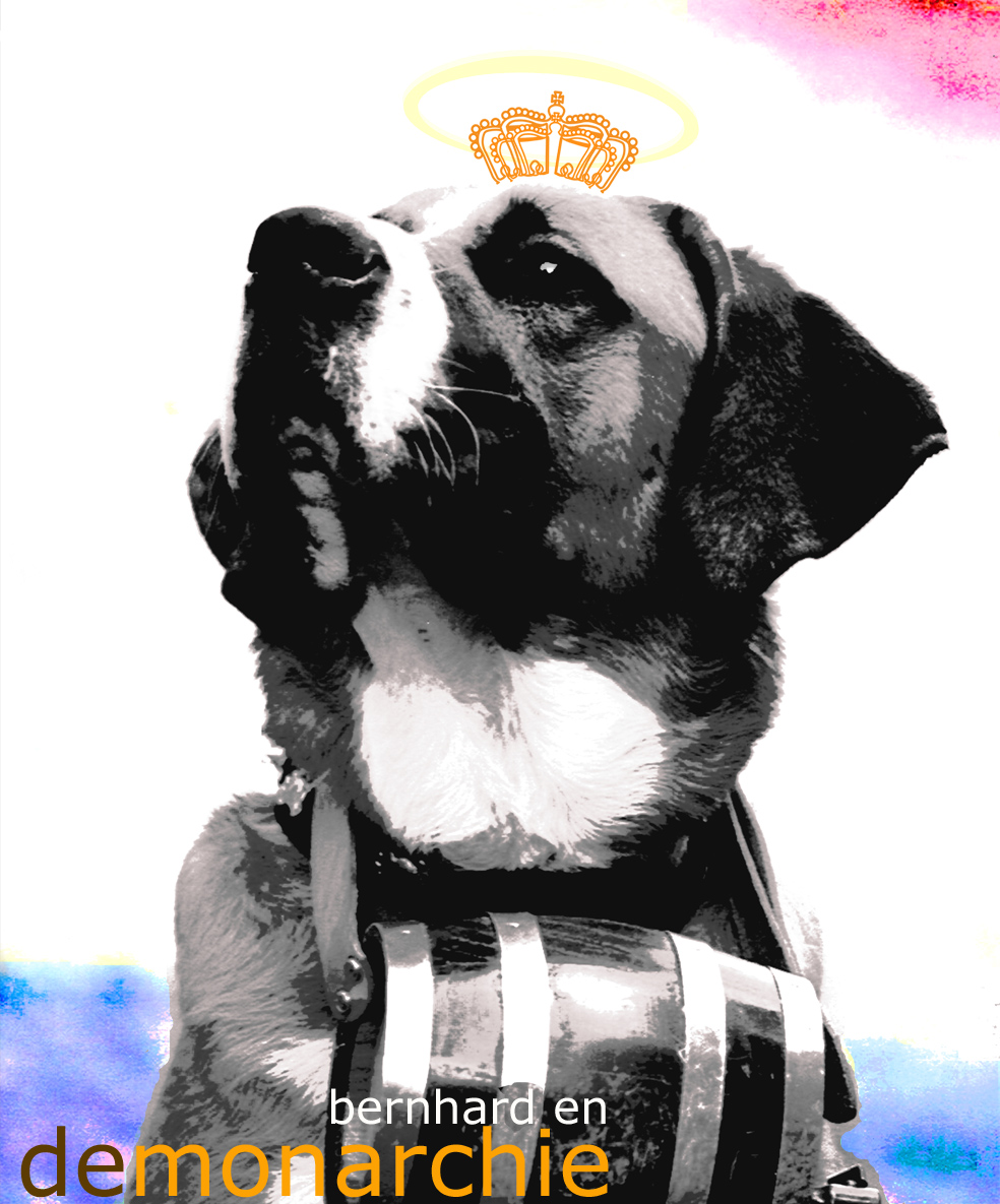
design frank waaldijk, VPRO Gids Cover 1, 2010 (click on the image for an enlargement)

the design was largely based on the vpro briefing, in which the television series `bernhard, scoundrel of orange' featured prominently. elements in the design: the picture of the st. bernard dog to me is the symbolization of the sanctimonious denial by bernhard of all his missteps, i added the halo for the same effect. the dog is in black and white, visualizing that all this was in the past (bernhard passed away in 2004; original colour photo of the st. bernard by daniel steger, under a creative commons license 2.5, which implies my design is under the same cc 2.5 license, see the original picture on wikipedia)

the orange crown was added, to picture bernhard as saviour of the monarchy. you will see the colours of our national flag in the background. all in keeping with the sanctimonious picture of our royal family as being good for our country.

the added text reads: `bernhard and the monarchy' ... however, i added a little venom, because in dutch this would read `bernhard en de monarchie' but if you look carefully you will see that there is in fact no space between `de' and `monarchie' so it really reads (though unobtrusively so):

`bernhard and demonarchy'

$$$$$$$

not a very brilliant design perhaps, but it finally gave me the opportunity to vent some of the indignation i felt as an 11 yr old, when bernhard wasn't even prosecuted for his corruption.

oh, i also made a version with lettering (but i could not easily obtain high quality fonts) because i thought it would be nice if the halo passed through the lettering:

design frank waaldijk with logo, VPRO Gids Cover 1, 2010
design frank waaldijk with logo, VPRO Gids Cover 1, 2010 (click on the image for an enlargement)

Tuesday, January 11, 2011

monarchy & vpro continued 2 (more digital design)

you really should read the previous post first, if you wish to understand the designs in this post...but one element needs to be added: the colour orange is our national colour, because...of prince william of orange, who fought against the spanish rule in the 16th century. since then, our monarchs, who only vaguely descend from this william, are called `de oranjes' (the orange ones). so you understand why the colour is used so much in these designs...

and i'm just making a small selection from http://weblogs.vpro.nl/cover1/inzendingen2010/, with little comment.

design frank dennissen, VPRO Gids Cover 1, 2010
design by frank dennissen, VPRO Gids Cover 1, 2010

design opmaak 1, VPRO Gids Cover 1, 2010
design by opmaak 1, VPRO Gids Cover 1, 2010, the text reads: `will you save the monarchy? you decide who must leave the arena. so text The Name to 2010"

design tim juffemans, VPRO Gids Cover 1, 2010
design tim juffemans, VPRO Gids Cover 1, 2010 (click on the image for an enlargement, it contains references to a number of controversies surrounding the royal family, including a holiday resort in mozambique [see the machangulo affair on wikipedia], and the shot (dutch) lion is the topping...)

design frank voors, VPRO Gids Cover 1, 2010
design by frank voors, VPRO Gids Cover 1, 2010 (bernhard was a notorious lover of fast cars...)

design sanne van dragt, VPRO Gids Cover 1, 2010
design by sanne van dragt, VPRO Gids Cover 1, 2010

design basic cmyk, VPRO Gids Cover 1, 2010
design by basic cmyk, VPRO Gids Cover 1, 2010

design print, VPRO Gids Cover 1, 2010
design by print, VPRO Gids Cover 1, 2010

&&&&&&

there were more designs which i thought were compelling, including some very nice drawings:

design jasper rietman, VPRO Gids Cover 1, 2010
design by jasper rietman, VPRO Gids Cover 1, 2010 (click for an enlargement, worth the trouble)

and a drawing with no real message that i could see, but which i just like very much as a drawing depicting `typically dutch' stuff:

design dominique pattipawaij, VPRO Gids Cover 1, 2010
design by dominique pattipawaij, VPRO Gids Cover 1, 2010

my own design will follow in the next post (i certainly don't consider it to be the best, i just like to present it and explain a little).

more vpro cover, prince bernhard, art in our merchant society, monarchy (digital design)

oh well, i'm still not done. in 2010 i also participated in the vpro cover design contest, the theme then was: `monarchy'. but, as was explicitly stated, the main reason for this theme was the new television series to be aired by the vpro, called `bernhard, scoundrel of orange' (`bernhard, schavuit van oranje') about the life of prince bernhard, husband of our former queen juliana.

prince bernhard was severely compromised in the '70s for accepting bribes from lockheed and other parties, in his role as military adviser to the government. he also fathered two extra-marital children. before the war he was a member of the nsdap and the reiter ss, which he first denied and when confronted with paper evidence he claimed to have been made member without his knowledge (although contribution was paid promptly and meticulously for years). also he was already a member of the deutsche studentenschaft from 1932-1934 with an application form filled out in his own handwriting (the studentenschaft was also clearly nationalsozialistisch -in other words nazi).

when caught in the bribery act, he was -naturally- facing indictment and trial. however, queen juliana said she would abdicate if her husband was put on trial and daughter beatrix (our current queen) said she would not take up the throne in this way.

so...what do you think happened? i was 11 yrs old at the time and i still feel the indignation of what our government concocted. they decided to not put bernhard on trial, to save the monarchy. if you even think bernhard had to pay back the money, you are wrong. his punishment consisted of stripping him of his military uniform in public appearances and relieving him of his advisory function. wow. any `common' shoplifter or thief is treated with harsh justice, for let's say a couple of thousand at the most, but when it comes to millions, the high society protects itself...

these are not the only scandals and controversies surrounding bernhard. read for yourself on wikipedia: prince bernhard von lippe-biesterfeld.

so you can imagine this theme also caught my attention. we are a so-called democracy, but still our monarch has some not unimportant political functions. a strange state of affairs. monarchs' succession is by birthright, so it must be that some special status is accorded to `being the child of'. still, our future king willem alexander married maxima zorreguieta. she is the daughter of jorge zorreguieta, (civilian) member of the argentine military junta of jorge videla, which was responsible for the calculated murder of thousands of dissident civilians from 1976-1983 (in the so-called dirty war).

i am the first to state that children bear no automatic responsibility for the actions of their parents, and i have nothing against maxima, but in this case i find it extremely unacceptable for our future king to be wedded to her. ok, they should have married, let love prevail, but then let someone else take the throne. if anything good can be ascribed to monarchy, it should be about representation, about making the right choices. what message do we give to all the bereft argentine mothers, fathers, children, who saw their beloved taken away in the night never to return?

from wikipedia:
The news of the couple's relationship and eventual marriage plans caused controversy in the Netherlands. Máxima's father had been the Minister of Agriculture during the regime of former Argentine President Jorge Rafael Videla, a military dictator who ruled Argentina from 1976 to 1981 and who was responsible for many atrocities against civilians (An estimated 10,000–30,000 people disappeared during this and subsequent military regimes before democracy was restored to Argentina in 1983). Jorge Zorreguieta claimed that, as a civilian, he was unaware of the Dirty War while he was a cabinet minister. Professor Baud, who on request of the Dutch Parliament did an inquiry in the involvement of Zorreguieta, concluded that would it have been unlikely for a person in such a powerful position in the government to be unaware of the Dirty War.[1]

in order to understand all the designs that were sent to the vpro for this `monarchy' theme, i should fill pages...but you get the drift of what lies beneath the surface of our happy orange household...

but one big benefit of our monarchy usually remains underexposed: the entertainment value. several gossip magazines rely almost exclusively on our royal family for their existence. if the queen plus entourage get a salary of millions of euro's, this may seem large, but divided by our population it yields an attractive per capita amusement tax [added later: the cost of the royal family turns out to be the staggering figure of 114 million euros per year, where i thought it would be 10 million max. incredible.]. therefore i would advise all other civilized countries to reinstate monarchy if they haven't been able to maintain one over the centuries!

in this spirit, one of the best designs for the 2010 vpro cover i thought was the one below by teun van den wittenboer (if teun or vpro object, please let me know and i will remove the image, although it can be seen at the link above):

design teun van den wittenboer, VPRO Gids Cover 1, 2010

the text reads: "the -up 'till now hidden- second tattoo of bernhard".

you might wonder what i find so brilliant about this...but i think the image is perfectly executed, and i also consider the idea to be a brilliant mockery of what we dutch think of as important in life...the exterior body, and silly secrets. we do not take the time to ponder the real implications of our monarchy, instead we are fascinated by gossip-magazine items and glitter and glamour.

the jury -as expected somewhat i must say, since i have now seen more years of designs and jurying- did not spot this design, it seems. the winning design was -contrary to my expectations which were obviously too high- a very non-committal silhouette of our queen, nothing more. well, no controversy there, a very safe choice! but not really in concordance with the original commission if you ask me. and for me it also raises the question of how critical our television broadcasting associations really are. i hope we will not drift towards an italian situation, where television is largely mind-numbingly stupid entertainment.

we need critics! we need people who dare speak out against superficiality and money/power/sex as a sole goal in life. so i hope the vpro will continue to orient itself towards such a critical role.

anyway, the jury did pick out the following design by michelle sipers, which i also think is very good (see the above remark about removing the image):

design michelle sipers, VPRO Gids Cover 1, 2010

i will perhaps pick out some more designs in the next post.