Showing posts with label nuclear energy. Show all posts

Friday, April 8, 2011

fukushima: our problems hoisted on future generations

the cleaning up of the millions of gallons of radioactive water at fukushima (which are a waste result of the attempts to cool the daiichi nuclear plant with water to prevent meltdown) could take decades, according to expert opinions reported in the LA Times, if it can be resolved at all.

these news items have a tendency to be understated, because the nature of news is like an extreme version of the nature of fashion, and seldom does public attention linger on any one issue if there are no `dramatic' turns of events.

but since we were discussing these topics on this blog, i felt i should mention this hoisting of our problems on future generations. the cleaning of this nuclear wastewater is actually but a minor issue compared to the nuclear waste that we are creating all over the world, for which we have no long-term solution either.

so, as an artist, perhaps you can see how serious i am on this issue when i say: forget about art, but do not forget about the next generations. who gave us the right to pollute the world in an irreversible manner for eons to come?

Monday, March 14, 2011

nuclear energy & earthquake japan

i am very sorry to see my very recent admonishments about the dangers of nuclear energy viz. natural disasters proved true by the completely dreadful earthquake which occurred last week in japan. i hope the people there will manage to contain the damage, and overcome this terrible adversity.

i also hope this will finally set people thinking about our completely irresponsible way of creating nuclear pollution for ages and ages to come.

when will we learn that we should not burden the next generations with our problems? when are we going to say: the buck stops here?

Tuesday, January 25, 2011

nuclear energy & art 3: chicago & henry moore

to finish the thread, there is also a (in my eyes) disturbing sculpture `nuclear energy' by henry moore, which was commissioned to mark the place where the first makeshift nuclear reactor was realized in chicago (chicago pile-1). the sculpture was erected in 1967 at the celebration of the 25th anniversary of the splitting of the atom on the grounds by enrico fermi on december 2, 1942.

nuclear energy, henry moore
henry moore, nuclear energy (picture lenka reznicek, click on the image for an enlargement, cc-license see the link)
It’s a rather strange thing really but I’d already done the idea for this sculpture before Professor McNeill and his colleagues from the University of Chicago came to see me on Sunday morning to tell me about the whole proposition. They told me (which I’d only vaguely known) that Fermi, the Italian nuclear physicist, started or really made the first successful controlled nuclear fission in a temporary building. I think it was a squash court - a wooden building - which from the outside looked entirely unlike where a thing of such an important nature might take place. But this experiment was carried on in secret and it meant that by being successful Man was able to control this huge force for peaceful purposes as well as destructive ones. They came to me to tell me that they thought where such an important event in history took place ought to be marked and they wondered whether I would do a sculpture which would stand on the spot. (Henry Moore quoted in Art Journal, New York, spring 1973, p.286)


i think moore captured this duality rather too well...the sculpture reminds me of a giant skull. i don't think this is quite coincidental either, because imho moore was a great artist.

lenka reznicek writes a blog called radioactive! the nuclear blog, below is another of her pictures (creative commons licensed, go to her flickr page -link above- for the full license).

caution do not dig, lenka reznicek
plot m marker, red gate woods chicago (photo lenka reznicek, click on the image for an enlargement).

enrico fermi died in 1954 of stomach cancer, as a result of overexposure to radiation. below his image in a graffiti tribute from vitoria in spain:

enrico fermi, mural graffiti

Monday, January 24, 2011

nuclear energy & art 2 (into eternity)

[continued from the previous post]

apart from its ominous content, i found michael madsen's documentary `into eternity' quite artistic, showing people in a natural setting, answering well-structured questions, but at the same time painting a contradictory canvas of the issue and human arrogance/insecurity at the same time.

still, i was even more triggered by one of the main problems posed in the documentary:
Once the repository waste has been deposited and is full, the facility is to be sealed off and never opened again. Or so we hope, but can we ensure that? And how is it possible to warn our descendants of the deadly waste we left behind? How do we prevent them from thinking they have found the pyramids of our time, mystical burial grounds, hidden treasures? Which languages and signs will they understand? And if they understand, will they respect our instructions? While gigantic monster machines dig deeper and deeper into the dark, experts above ground strive to find solutions to this crucially important radioactive waste issue to secure mankind and all species on planet Earth now and in the near and very distant future.

especially of course the question: which languages and signs will people still understand after 50,000 years?

in the documentary the conclusion seems to be (and i agree) that visual language (art!) is so universal for humanity, that it can be assumed that even 50,000 years from now people will still understand parts of well-executed comics, cartoons, drawings and paintings. other languages and communication mechanisms appear to be rather less time-resistant. many old languages can no longer be understood by us, but the pictorial representations are still easily recognized.

however, in the special case of radiation, one has to wonder if one can visualize radiation if the phenomenon is outside the scientific awareness of the people involved. the second question is: will any visual sign/representation be endurable enough to survive such an onslaught of time?

this ties in to the earlier discussion this year about the importance of art and art education: since our thinking has a large visual component, our ideas can often be expressed far clearer in pictures than in words. so here you have an example of a real challenge to art: can we visualize (the presence of) radiation in such a way that even people with little or no scientific background will understand its dangers and enough of its working mechanisms?


trailer from `into eternity'

Sunday, January 23, 2011

nuclear energy & art: into eternity

last week i saw a documentary by michael madsen called `into eternity'. let me cite from wikipedia:
Into Eternity is a feature documentary film directed by Michael Madsen.[1] It follows the digging and pre-implementation of the Onkalo nuclear waste repository in Olkiluoto, Finland. Director Michael Madsen is questioning Onkalo's intended eternal existence, addressing a remotely future audience. More importantly, this documentary raises the question of the authorities responsibility of ensuring compliance with relatively new safety criteria legislation and the principles at the core of nuclear waste management.[2]

Background information
This movie is the only full-length documentary about nuclear waste underground repository storage solution. The concept of long-term underground storage has been explored already from the 50's. The inner part of the Russian doll-like storage canisters is to be composed of copper. Hence in the case of Onkalo it is tightly linked to experimentations on copper corrosion in running groundwater flow.[3] Application for the implementation of spent nuclear fuel repository was submitted by Posiva Oy in 2001. The excavation itself started in 2004. With a total of 4 operable reactors providing 25% of the country energy supply, Finland ranks 16th in the world nuclear power reactors country list topped by USA (104 reactors), France (58 reactors) and Japan (54 reactors).

Synopsis

Every day, the world over, large amounts of high-level radioactive waste created by nuclear power plants is placed in interim storage, which is vulnerable to natural disasters, man-made disasters, and societal changes. In Finland, the world’s first permanent repository is being hewn out of solid rock – a huge system of underground tunnels – that must last the entire period the waste remains hazardous: 100,000 years.

Once the repository waste has been deposited and is full, the facility is to be sealed off and never opened again. Or so we hope, but can we ensure that? And how is it possible to warn our descendants of the deadly waste we left behind? How do we prevent them from thinking they have found the pyramids of our time, mystical burial grounds, hidden treasures? Which languages and signs will they understand? And if they understand, will they respect our instructions? While gigantic monster machines dig deeper and deeper into the dark, experts above ground strive to find solutions to this crucially important radioactive waste issue to secure mankind and all species on planet Earth now and in the near and very distant future.

before talking about the artistic aspects, once again, dear reader, i wish to draw your attention to the ominous content of the documentary, and the enormous implications of our current involvement in nuclear energy.

i repeat from an earlier post: we are apes playing with fire. but even that is a weak metaphor. we are apes playing with Eternal Pollution, we are producing nuclear waste that will pollute our world for hundreds of thousands of years, and we DO NOT KNOW HOW TO SOLVE THAT PROBLEM. we also have currently no nuclear waste storage facilities which will withstand natural disasters, so the problem is not only in the future, it is here and now. (and don't forget all the incidents that happen in nuclear plants, please don't think that they are safe because they aren't, we could easily have another chernobyl. and even if that could be addressed, what do you think the greatest nightmare of anti-terrorist agencies is?)

chernobyl radiation map 1996, cia factbook
radiation map of chernobyl in 1996, 10 years after the chernobyl disaster (image from the cia factbook, click on the image for an enlargement)

chernobyl seen from pripyat, 2007, jason minshull
chernobyl seen from the abandoned town of pripyat in 2007, 20 years after the chernobyl disaster (photo by jason minshull, click on the image for an enlargement)

[to be continued]

Monday, January 10, 2011

nuclear energy (vpro cover, digital design) continued

i would like to describe where the previous design came from (let me repeat it below for best reading, design for the january 2007 vpro cover, click on the image for a large enlargement)

v-pro of contra, design frank waaldijk, VPRO Gids Cover 1, 2007

some elements:

in 1982 in my final year in high school i made a cynical postcard `greetings from kalkar'. at the time there were plans for a nuclear plant in kalkar, and i was very much against. the card was meant as a cynical depiction of how a nuclear plant could (never) be a touristic feature...

however, strangely enough, the plans were ultimately cancelled, leaving the already constructed outer building with no clear purpose. in the nineties, this building was converted in a water-based attraction park for recreation, and called kernwasser wunderland, today the park is called wunderland kalkar...and what once was a cynical postcard now is simply touristic reality...incredible, isn't it?

greetings from kalkar, frank waaldijk 1982

cooling tower used as climbing wall in wunderland kalkar

you can see how i used elements from the postcard in the vpro design...

%%%%%%%

for dramatic effect, i also used a figure from a painting by rubens (but since a computer crash, i have been unable to refind the original painting from which this figure was taken...i've tried searching for it with google, but to no avail.

the direction of looking of the original figure was dramatically upward (far more so than in this design), i photoshopped until the face had the right expression. then i also added a radiation burn pattern on the face...because in my not so humble opinion we are taking an extremely unfair risk with regard to future generations.

detail rubens, vpro design frank waaldijk, 2007

&&&&&&&

in the background, the dramatic picture of the sun is actually a depiction of a much safer form of nuclear energy: fusion. both solar energy and possibly in the future nuclear energy from fusion are far more sustainable than our current nuclear plants imnsho.

in the foreground, i have tried to recreate the old photographic effect of solarisation (arising from overexposure of negatives in a certain way):

detail solarisation, vpro design frank waaldijk, 2007

&&&&&&&

to clarify the borssele connection, i added this element in the standard design of dutch town limits:

detail borssele, vpro design frank waaldijk, 2007

then of course the lettering: the commission always states to leave out the lettering and the vpro logo. but in this case i did not have much faith in the vpro's own layout, and also i wanted to sharpen the theme by adding `vpro or contra'.

*******

so, there you have the different layers of the design all spelled out...perhaps you can understand why i am still very contented with this design, perhaps not.

*******

to finish, another design which i thought was `cool'...;-) by judith van meeuwen [there were many other cool designs, unfortunately the vpro has removed the higher resolution pictures and this is the best i can offer; if judith or vpro object to my reproducing it here, please let me know and i will remove it]:

new energy, vpro design judith van meeuwen, 2007

it is a really mystifying, atmospheric design, which to me has all the intrigue of something we don't know about yet, and which is also clearly about energy.

Wednesday, January 5, 2011

nuclear energy, vpro cover, art in our merchant society (more digital design)

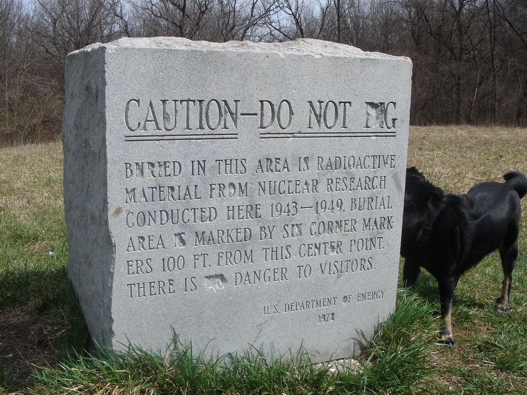
so in this thread (art in our merchant society, vpro cover competition, digital design) i would like to put up a design i made a few years back for the vpro cover competition. the theme given was: `new energy' and the explanation talked about the dilemmas facing our society with regard to dwindling traditional energy supplies (oil, gas, coal). any design featuring this theme and /or this dilemma was welcome, also with an enthusiastic invitation to think of new forms of energy.

at the time an important decision had just been made by the (previous) dutch government regarding nuclear energy, namely to continue operating the nuclear plant in borssele until 2033 (instead of closing it down in 2013, as was the earlier plan). the decision had been taken in june, but in november a new government had been elected, and public discussion about nuclear energy should have been priority in my not so humble opinion. the political debate was whether to create even more nuclear plants, to maintain status quo or to strive for elimination.

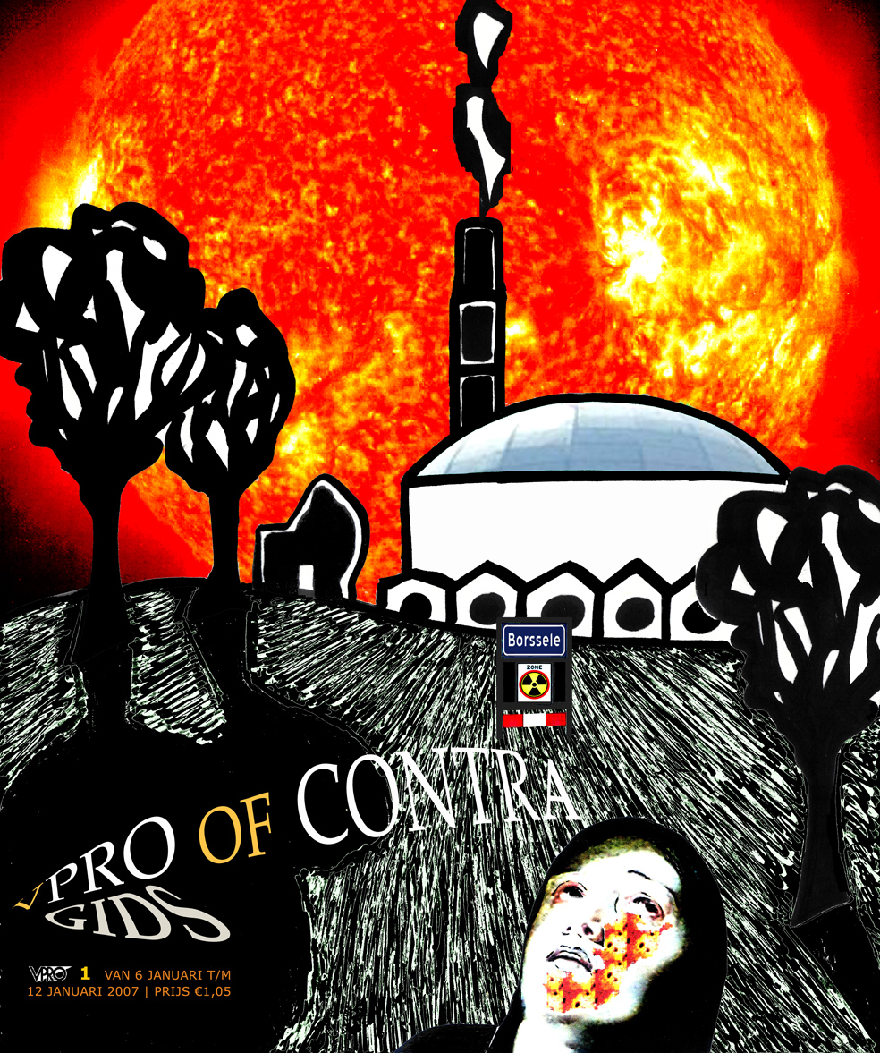
since then plans for a second nuclear plant in borssele have been developed. so before this, and in the backlight of this debate, i made the design below:

v-pro of contra, design frank waaldijk, VPRO Gids Cover 1, 2007

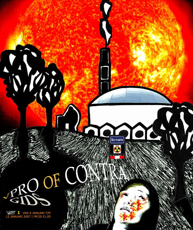
(my design for the january 2007 vpro cover, click on the image for a large enlargement)

&&&&&&

before talking about the design in particular designerspeak (if i'm even capable of that...), i'd like to note that there were -as usual- many wonderful designs. i do not envy a jury! but given the fact that energy is a serious societal problem, i somehow would expect that designs focusing on the problematic side of the commission would also get some attention. in my recollection, the jury picked almost exclusively `light' designs.

well, like i said, don't expect me to be any better in picking nominees or winners...! but to grumpy old me, this perceived favouritism for `light' (funny, easy to grasp, nudge nudge, tongue-in-cheek) designs seems a bit symptomatic of the underestimation in the netherlands of visual art, and of the importance of having a good visual training/education, perhaps i should call this "imagery education".

because an image speaks a thousands words.

much of what we think is governed by images, more than by words. if i want to know if you have understood something, what will i ask most frequently? i believe this to be the question: "you see?".

$$$$$$

but in our merchant society, we have degraded art education in our secondary schools to a very unimportant position. we have made mathematics compulsory for all years of secondary school, as well as foreign languages (merchant merchant!). but we neglect to educate values, emotions, clear thinking, artisticity, creativity, criticism, ...all necessary elements for a culturally and economically thriving society, which also can take its responsibility when it comes to long-term decisions affecting the well-being also of future generations.

can we put a price on being able to live in a non-polluted environment? can we trade the extinction of the whale against a 5 ct reduction in the price of bread? can we trade the cost of war in afghanistan and iraq against the funds necessary to help people starving or struck by natural disaster? ...apparently we can. but future generations will hold us responsible, and rightly so.

and this is what artists can and do tackle, and do try to attract attention to. with images and imagery that cannot be ignored (if the artist is worth her/his salt AND if the merchant mentality in society is not completely dominant).

[wow, frank in rant mode...to be continued, since i forgot to talk about the design in designerspeak -which i probably don't speak anyway, but...]