Wednesday, January 5, 2011

nuclear energy, vpro cover, art in our merchant society (more digital design)

so in this thread (art in our merchant society, vpro cover competition, digital design) i would like to put up a design i made a few years back for the vpro cover competition. the theme given was: `new energy' and the explanation talked about the dilemmas facing our society with regard to dwindling traditional energy supplies (oil, gas, coal). any design featuring this theme and /or this dilemma was welcome, also with an enthusiastic invitation to think of new forms of energy.

at the time an important decision had just been made by the (previous) dutch government regarding nuclear energy, namely to continue operating the nuclear plant in borssele until 2033 (instead of closing it down in 2013, as was the earlier plan). the decision had been taken in june, but in november a new government had been elected, and public discussion about nuclear energy should have been priority in my not so humble opinion. the political debate was whether to create even more nuclear plants, to maintain status quo or to strive for elimination.

since then plans for a second nuclear plant in borssele have been developed. so before this, and in the backlight of this debate, i made the design below:

v-pro of contra, design frank waaldijk, VPRO Gids Cover 1, 2007

(my design for the january 2007 vpro cover, click on the image for a large enlargement)

&&&&&&

before talking about the design in particular designerspeak (if i'm even capable of that...), i'd like to note that there were -as usual- many wonderful designs. i do not envy a jury! but given the fact that energy is a serious societal problem, i somehow would expect that designs focusing on the problematic side of the commission would also get some attention. in my recollection, the jury picked almost exclusively `light' designs.

well, like i said, don't expect me to be any better in picking nominees or winners...! but to grumpy old me, this perceived favouritism for `light' (funny, easy to grasp, nudge nudge, tongue-in-cheek) designs seems a bit symptomatic of the underestimation in the netherlands of visual art, and of the importance of having a good visual training/education, perhaps i should call this "imagery education".

because an image speaks a thousands words.

much of what we think is governed by images, more than by words. if i want to know if you have understood something, what will i ask most frequently? i believe this to be the question: "you see?".

$$$$$$

but in our merchant society, we have degraded art education in our secondary schools to a very unimportant position. we have made mathematics compulsory for all years of secondary school, as well as foreign languages (merchant merchant!). but we neglect to educate values, emotions, clear thinking, artisticity, creativity, criticism, ...all necessary elements for a culturally and economically thriving society, which also can take its responsibility when it comes to long-term decisions affecting the well-being also of future generations.

can we put a price on being able to live in a non-polluted environment? can we trade the extinction of the whale against a 5 ct reduction in the price of bread? can we trade the cost of war in afghanistan and iraq against the funds necessary to help people starving or struck by natural disaster? ...apparently we can. but future generations will hold us responsible, and rightly so.

and this is what artists can and do tackle, and do try to attract attention to. with images and imagery that cannot be ignored (if the artist is worth her/his salt AND if the merchant mentality in society is not completely dominant).

[wow, frank in rant mode...to be continued, since i forgot to talk about the design in designerspeak -which i probably don't speak anyway, but...]

Tuesday, January 4, 2011

art in our merchant society 2 (more digital design)

[see also previous post! oh well, i'm careening a bit between two subjects (see the ambiguous title), sorry]

Klein_Marcel

marcel klein's design for the vpro cover competition (see previous post, not nominated by the jury - i take it for granted neither marcel nor vpro will mind my putting up this design on my blog, if so just let me know and i will remove it and replace it with just the link).

i like it for a couple of reasons. the somewhat strange composition, which works out lively and elegant. but also the sharp juxtaposition of `old' and `new' technology - paper cut-outs and computer-related cables - in the form of a tree...which is what paper is made of, usually...and what also constitutes a big argument against paper, namely wouldn't we want those trees to serve a better purpose?

moreover, notwithstanding the briefing from the vpro which contained some nostalgia about paper being on its return, as far as i know our paper consumption has not decreased since the ICT revolution, but on the contrary has increased...perhaps because we print out all those emails and memos and reports and all the try-out versions of these products too, i don't know.

so the image also describes this process: a lot of electronic communication ends in physical paper...

therefore: nice! - but not immediately classifiable as an ode to paper, you could say. does that really disqualify this design? i would say on the contrary, it lifts the original commission to a higher level.

(grumpy me: i'm not completely enthusiastic about the colours, and one could also point out that the branching out of one of the electronic-cable-branches is a bit obviously photoshopped, so be it)

anyway, i'm not saying this design should have won or should have been nominated, but in comparison to some of the nominated designs it is clear that the jury looks more to direct visual effect than to possible deeper layers.

it would in my not so humble opinion be a step forward if also designs that consider a more complex message would get serious reconsideration. not only in this competition, but in cover designs overall.

%%%%%%

however, in a merchant society, i believe that subtle and/or complex art is bound to suffer. time is money, after all! if i cannot grasp the meaning of something in a few seconds, then i might lose valuable opportunities elsewhere...plus of course that only the most blatant art will impress my newfound family of rich entrepreneurs who also seek to impress me with their blatant modern art collection...

obviously i speak not in absolutes, but i believe this to be the general prevailing mechanism in modern (or contemporary if you prefer) art. and this is judging by what i see in museums and galleries specializing in the `top' of contemporary art. (but you know my views on quality mechanisms, else search this blog for `quality' (without the single quotes this becomes a funny statement, but perhaps true too...)).

it all boils down to the question:

what is art for?

in a merchant society, you can imagine the most common reply. and this is then subsequently what drives our art market, our art institutions, and if we are very very unlucky our artists as well.

Monday, January 3, 2011

art in our merchant society (more digital design)

every year, the dutch broadcasting corporation vpro holds an open design competition for the cover of its first magazine of the new year.

a very inspiring idea!!

and one should really look at all the designs that people make, they are put on the vpro's website for cover 1. it is very inspiring to see what is being made by young and old, professional and non-professional.

of course, i would'nt be grumpy old me if i wasn't grumpy old me, so i also see quite a number of drawbacks to the way this competition is organized, but...it remains a nice and original idea! for many amateur/semi-amateur designers, where can one find a similar opportunity to create a design with (if you win of course...) national exposure?

which is partly why i like to participate, from time to time. not every year, because i often don't feel much affinity with the selected theme (like this year's theme: `ode to paper' - it just doesn't do much for me, because for me the direction has been predetermined too much. it would have worked better for me if it had been simply: `paper', but even that probably would not really have set me on fire, i suppose, much as i like paper as a medium and also as a material).

so far i have participated twice, with designs that i really like and which naturally failed to draw any attention from the jury...;-) but thankfully i have reached a stage where i understand that drawing attention from a jury is a very subjective affair, and also isn't the only thing that makes a design worthwhile.

but even if i don't participate, i usually take quite some time to look at the designs made by others, because it is really inspiring, like i said. from this i have noticed that my way of looking is rather different than the jury's...if i were to nominate 10 designs, in most years there would be not more than one or two overlaps with the nomination of the jury, and frequently none.

%%%%%%%

the next will sound arrogant, i know. but to me it sometimes seems as if really intelligent design is at a disadvantage. i have seen some excellent designs going unnoticed [yeah i know you could now laugh at me, but i'm not talking about my own designs ;-)], where the only reason for this that i could think of was that the idea behind the design was subtle, and took more than a short moment's reflection to grasp.

this brings us back (i think i discussed this earlier on this blog, but i'm not sure!) to the discussion on how `popular' art should be. the vpro prides itself on bringing programs that bring real content and culture, a deepening of background shall we say. therefore i think that it is a real sign of the times that even in the vpro-setting `intelligent' design is at a disadvantage.

to me it seems that we dutch are simply not motivated to invest time and effort in building our culture to the point where art, music, literature, poetry, film, etc. are appreciated as a valuable way to determine what values we treasure, what ways we should go and what ways we should not go with our society.

our new government is a very appalling example of the merchant mind which seems to dominate the netherlands. what a poor culture my country really has, is sometimes obscured by the many great painters which were born in the netherlands. but they are really just a strange exception to the dutch rule.

and it is also surprising that with such a merchant mentality, many eminent scientists also came from the netherlands. however, this latter phenomenon cannot persist i believe. whereas the natural talent for painting seems to be indigenous, to maintain a high level of science requires a definite non-merchant mentality. i'm sure we will see the downslide of dutch science in the decades to come. and we deserve it, for being so short-sighted and narrow-minded.

now who will be able to illuminate the blind? traditionally, i would say, it should be the artists (all liberal arts included). but in our merchant society, they are currently being put down as irrelevant (unless commercially successful) and as being basically parasitic on society - i'm NOT joking.

this is what happens when we vote for people who have no real cultural upbringing, no real cultural reflection, no basis for the insight that the arts are about everything that we hold dear. who can only think in terms of success, failure, money, power, fear, control,...you get the idea.

what does beauty mean to these people? what does colour mean? a song or a poem that brings the tears to one's eyes?

[to be continued]

Saturday, January 1, 2011

new year's wish to all


new year's wish

(click on the image for an enlargement)

`zin' is an essentially untranslatable dutch word, it means as many things as:

1. sense
2. meaning
3. mind
4. point
5. spirit
6. feeling
7. signification
8. inclination
9. gusto

Wednesday, December 8, 2010

more photoshopped pictures 2

tyres, own work
tyres (own work 2008, click on the image for an enlargement)

the thing is: imnsho an artist needs to receive inspiration from anywhere, everywhere. our encounter with our world (`reality') is a complex puzzle, ever changing, and somehow it is the artist's job to create meaningful interpretation, commentary, beauty, transcendentality even. pretty ambitious, really, so perhaps no wonder this often fails...

[don't let yourself be fooled by all the cheering and back-clapping and genius-proclaiming of galleries and museums...transcendental art is very rare, lastingly meaningful art is rare, good art is less rare but still already a relief...all imnsho of course. this doesn't mean that the work done by artists is mostly in vain, on the contrary. often very consistently hard work is necessary to reach occasional rare levels of art. it's just that we shouldn't try to put everything created by artists on a pedestal.]

House centipede (scutigera coleoptrata)
house centipede trapped in glass (duly released after the photoshoot, own work 2007-2008, click on the image for an enlargement)

[the above image comes from wikimedia commons, where i uploaded it on a free-use license...and lucky i did, because i seem to have deleted this particular edit of the original picture on my own computer...good to find this back-up! like i said i'm still pondering the avenue of uploading much more of my (art and photographic) works on wikimedia commons]

3 days of the condor, own work
3 days of the condor (own work 2008, click on the image for an enlargement)

of course photographing condors is not without hazard...but the picture below was a truly breathtaking affair. with danger to his own life, your photographer was able to capture this contract killer as he left his cab! ;-)

3 days of the condor, own work
contract killer (own work 2008-2010, click on the image for an enlargement)

Monday, December 6, 2010

record sleeves for ralfk (ralf kwaaknijd) - more digital stuff 2

my fellow artist and friend ralf kwaaknijd has a site on saatchi online (i didn't hear him complaining about their terms of use, but anyway these terms have been changed for the better now), and three weeks ago he was picked out by well-known conservator and lecturer ben street as one of 10 artists of the week on saatchi online. good for ralf, but then again he has quite an impressive bio, having had shows in many major museums etc.

like some other reclusive artists, ralf still shuns publicity. little it is known therefore that he is also a musician, mainly guitar/songwriter, and he even brings out records in very limited editions, just for friends. his musician's name is ralfk, and yes, they are just vinyl records, no cds. expensive, but his work sells well, giving him a little leeway to pursue his music in the way he prefers.

anyway, he asked me to design sleeves for these records, (the front side of) 3 of which i will put up here below, in this thread of posts showing what nowadays is within reach with photoshop for anyone, as compared to the pre-digital era. they are perhaps not my finest graphical designs, but i also like to promote ralf kwaaknijd a little bit, so...here!

ralfk plays blues, own work
ralfk plays blues (own work 2008, click on the image for an enlargement)

ralfk plays blues, own work
ralfk plays aachen (own work 2009, click on the image for an enlargement)

ralfk plays blues, own work
ralfk plays the street (own work 2010, click on the image for an enlargement)

[oh, i should talk a little about these designs of course...the first being a portrait of ralf as a blues musician, which he refused initially to put on the sleeve, but i managed to convince him that these blues needed a portrait, more specifically a portrait like this one.

the second design came out of ralf's wish to relate to the cover of `abbey road' by the beatles, but he refused to be recognizably in the picture (but he is there...cameo-wise you might say).

the third design is the latest, reflecting on the fact that ralfk started out as a street musician. then as well as now, he often performs at night when most people are asleep...yet the picture is not taken at night, it is a simple black&white reversal...but it works well i believe.]

Sunday, December 5, 2010

more digital stuff, mostly mildly photoshopped pictures (don't expect elaborate digital art)

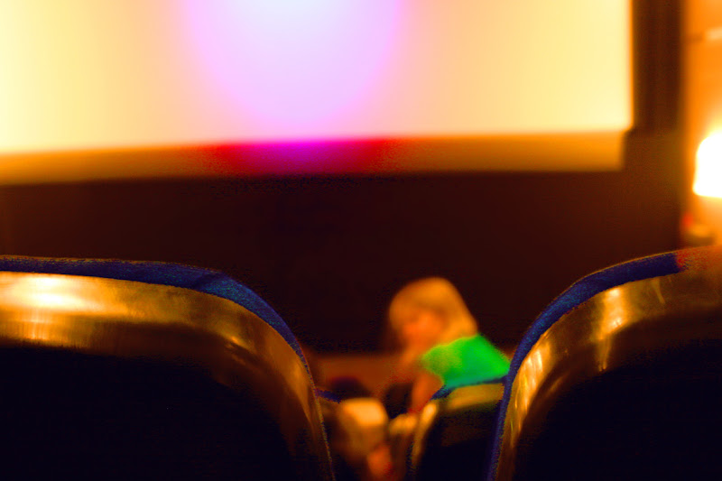
cinema, own work
cinema (own work 2008-2010, click on the image for an enlargement)

dark sky, polder, own work
dark sky, polder (own work 2010, click on the image for an enlargement)

liège 1985, own work
liège 1985 (own work 2008, click on the image for an enlargement)

still life with kiwi, own work
still life with kiwi (own work 2008-2010, click on the image for an enlargement)

&&&&&&

anyway, one point is: without photoshop i would never have been able to make these pictures. the analog technology necessary for producing anything remotely resembling these pictures is way above my head. i'm not saying they are so great or anything, but photoshop at least has opened a world of photography for me, that was quite closed to me before.

and taking pictures, especially of landscape and nature, is also an inspiring way to prepare visually for painting and drawing.

[to be continued]