some elements:
in 1982 in my final year in high school i made a cynical postcard `greetings from kalkar'. at the time there were plans for a nuclear plant in kalkar, and i was very much against. the card was meant as a cynical depiction of how a nuclear plant could (never) be a touristic feature...
however, strangely enough, the plans were ultimately cancelled, leaving the already constructed outer building with no clear purpose. in the nineties, this building was converted in a water-based attraction park for recreation, and called kernwasser wunderland, today the park is called wunderland kalkar...and what once was a cynical postcard now is simply touristic reality...incredible, isn't it?

cooling tower used as climbing wall in wunderland kalkar
you can see how i used elements from the postcard in the vpro design...
%%%%%%%
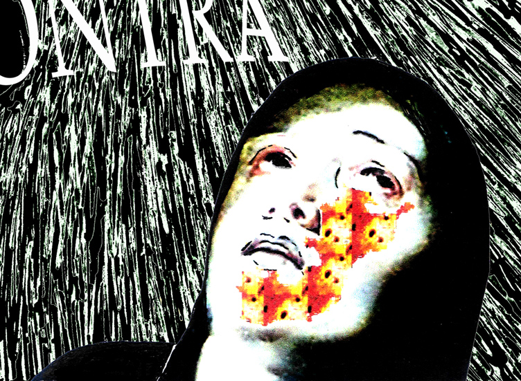
for dramatic effect, i also used a figure from a painting by rubens (but since a computer crash, i have been unable to refind the original painting from which this figure was taken...i've tried searching for it with google, but to no avail.
the direction of looking of the original figure was dramatically upward (far more so than in this design), i photoshopped until the face had the right expression. then i also added a radiation burn pattern on the face...because in my not so humble opinion we are taking an extremely unfair risk with regard to future generations.

&&&&&&&
in the background, the dramatic picture of the sun is actually a depiction of a much safer form of nuclear energy: fusion. both solar energy and possibly in the future nuclear energy from fusion are far more sustainable than our current nuclear plants imnsho.
in the foreground, i have tried to recreate the old photographic effect of solarisation (arising from overexposure of negatives in a certain way):

&&&&&&&
to clarify the borssele connection, i added this element in the standard design of dutch town limits:

then of course the lettering: the commission always states to leave out the lettering and the vpro logo. but in this case i did not have much faith in the vpro's own layout, and also i wanted to sharpen the theme by adding `vpro or contra'.
*******
so, there you have the different layers of the design all spelled out...perhaps you can understand why i am still very contented with this design, perhaps not.
*******
to finish, another design which i thought was `cool'...;-) by judith van meeuwen [there were many other cool designs, unfortunately the vpro has removed the higher resolution pictures and this is the best i can offer; if judith or vpro object to my reproducing it here, please let me know and i will remove it]:
new energy, vpro design judith van meeuwen, 2007
it is a really mystifying, atmospheric design, which to me has all the intrigue of something we don't know about yet, and which is also clearly about energy.

No comments:
Post a Comment