Monday, January 10, 2011

100,000 visits to this blog

well, not so much perhaps when compared to really well-visited sites, but surprising to me nonetheless! and i'm glad that what i put up here reaches a lot of people (although i get little feedback as to what they think of it ;-)), this is added motivation (although i would write for a few people just as well, but it does give the feeling that the (relatively new) internet really gives a new platform to people like me). thanx to all readers!

nuclear energy (vpro cover, digital design) continued

i would like to describe where the previous design came from (let me repeat it below for best reading, design for the january 2007 vpro cover, click on the image for a large enlargement)

v-pro of contra, design frank waaldijk, VPRO Gids Cover 1, 2007

some elements:

in 1982 in my final year in high school i made a cynical postcard `greetings from kalkar'. at the time there were plans for a nuclear plant in kalkar, and i was very much against. the card was meant as a cynical depiction of how a nuclear plant could (never) be a touristic feature...

however, strangely enough, the plans were ultimately cancelled, leaving the already constructed outer building with no clear purpose. in the nineties, this building was converted in a water-based attraction park for recreation, and called kernwasser wunderland, today the park is called wunderland kalkar...and what once was a cynical postcard now is simply touristic reality...incredible, isn't it?

greetings from kalkar, frank waaldijk 1982

cooling tower used as climbing wall in wunderland kalkar

you can see how i used elements from the postcard in the vpro design...

%%%%%%%

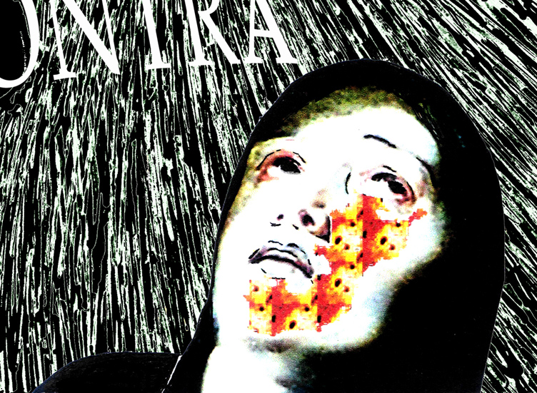
for dramatic effect, i also used a figure from a painting by rubens (but since a computer crash, i have been unable to refind the original painting from which this figure was taken...i've tried searching for it with google, but to no avail.

the direction of looking of the original figure was dramatically upward (far more so than in this design), i photoshopped until the face had the right expression. then i also added a radiation burn pattern on the face...because in my not so humble opinion we are taking an extremely unfair risk with regard to future generations.

detail rubens, vpro design frank waaldijk, 2007

&&&&&&&

in the background, the dramatic picture of the sun is actually a depiction of a much safer form of nuclear energy: fusion. both solar energy and possibly in the future nuclear energy from fusion are far more sustainable than our current nuclear plants imnsho.

in the foreground, i have tried to recreate the old photographic effect of solarisation (arising from overexposure of negatives in a certain way):

detail solarisation, vpro design frank waaldijk, 2007

&&&&&&&

to clarify the borssele connection, i added this element in the standard design of dutch town limits:

detail borssele, vpro design frank waaldijk, 2007

then of course the lettering: the commission always states to leave out the lettering and the vpro logo. but in this case i did not have much faith in the vpro's own layout, and also i wanted to sharpen the theme by adding `vpro or contra'.

*******

so, there you have the different layers of the design all spelled out...perhaps you can understand why i am still very contented with this design, perhaps not.

*******

to finish, another design which i thought was `cool'...;-) by judith van meeuwen [there were many other cool designs, unfortunately the vpro has removed the higher resolution pictures and this is the best i can offer; if judith or vpro object to my reproducing it here, please let me know and i will remove it]:

new energy, vpro design judith van meeuwen, 2007

it is a really mystifying, atmospheric design, which to me has all the intrigue of something we don't know about yet, and which is also clearly about energy.

Wednesday, January 5, 2011

nuclear energy, vpro cover, art in our merchant society (more digital design)

so in this thread (art in our merchant society, vpro cover competition, digital design) i would like to put up a design i made a few years back for the vpro cover competition. the theme given was: `new energy' and the explanation talked about the dilemmas facing our society with regard to dwindling traditional energy supplies (oil, gas, coal). any design featuring this theme and /or this dilemma was welcome, also with an enthusiastic invitation to think of new forms of energy.

at the time an important decision had just been made by the (previous) dutch government regarding nuclear energy, namely to continue operating the nuclear plant in borssele until 2033 (instead of closing it down in 2013, as was the earlier plan). the decision had been taken in june, but in november a new government had been elected, and public discussion about nuclear energy should have been priority in my not so humble opinion. the political debate was whether to create even more nuclear plants, to maintain status quo or to strive for elimination.

since then plans for a second nuclear plant in borssele have been developed. so before this, and in the backlight of this debate, i made the design below:

v-pro of contra, design frank waaldijk, VPRO Gids Cover 1, 2007

(my design for the january 2007 vpro cover, click on the image for a large enlargement)

&&&&&&

before talking about the design in particular designerspeak (if i'm even capable of that...), i'd like to note that there were -as usual- many wonderful designs. i do not envy a jury! but given the fact that energy is a serious societal problem, i somehow would expect that designs focusing on the problematic side of the commission would also get some attention. in my recollection, the jury picked almost exclusively `light' designs.

well, like i said, don't expect me to be any better in picking nominees or winners...! but to grumpy old me, this perceived favouritism for `light' (funny, easy to grasp, nudge nudge, tongue-in-cheek) designs seems a bit symptomatic of the underestimation in the netherlands of visual art, and of the importance of having a good visual training/education, perhaps i should call this "imagery education".

because an image speaks a thousands words.

much of what we think is governed by images, more than by words. if i want to know if you have understood something, what will i ask most frequently? i believe this to be the question: "you see?".

$$$$$$

but in our merchant society, we have degraded art education in our secondary schools to a very unimportant position. we have made mathematics compulsory for all years of secondary school, as well as foreign languages (merchant merchant!). but we neglect to educate values, emotions, clear thinking, artisticity, creativity, criticism, ...all necessary elements for a culturally and economically thriving society, which also can take its responsibility when it comes to long-term decisions affecting the well-being also of future generations.

can we put a price on being able to live in a non-polluted environment? can we trade the extinction of the whale against a 5 ct reduction in the price of bread? can we trade the cost of war in afghanistan and iraq against the funds necessary to help people starving or struck by natural disaster? ...apparently we can. but future generations will hold us responsible, and rightly so.

and this is what artists can and do tackle, and do try to attract attention to. with images and imagery that cannot be ignored (if the artist is worth her/his salt AND if the merchant mentality in society is not completely dominant).

[wow, frank in rant mode...to be continued, since i forgot to talk about the design in designerspeak -which i probably don't speak anyway, but...]

Tuesday, January 4, 2011

art in our merchant society 2 (more digital design)

[see also previous post! oh well, i'm careening a bit between two subjects (see the ambiguous title), sorry]

Klein_Marcel

marcel klein's design for the vpro cover competition (see previous post, not nominated by the jury - i take it for granted neither marcel nor vpro will mind my putting up this design on my blog, if so just let me know and i will remove it and replace it with just the link).

i like it for a couple of reasons. the somewhat strange composition, which works out lively and elegant. but also the sharp juxtaposition of `old' and `new' technology - paper cut-outs and computer-related cables - in the form of a tree...which is what paper is made of, usually...and what also constitutes a big argument against paper, namely wouldn't we want those trees to serve a better purpose?

moreover, notwithstanding the briefing from the vpro which contained some nostalgia about paper being on its return, as far as i know our paper consumption has not decreased since the ICT revolution, but on the contrary has increased...perhaps because we print out all those emails and memos and reports and all the try-out versions of these products too, i don't know.

so the image also describes this process: a lot of electronic communication ends in physical paper...

therefore: nice! - but not immediately classifiable as an ode to paper, you could say. does that really disqualify this design? i would say on the contrary, it lifts the original commission to a higher level.

(grumpy me: i'm not completely enthusiastic about the colours, and one could also point out that the branching out of one of the electronic-cable-branches is a bit obviously photoshopped, so be it)

anyway, i'm not saying this design should have won or should have been nominated, but in comparison to some of the nominated designs it is clear that the jury looks more to direct visual effect than to possible deeper layers.

it would in my not so humble opinion be a step forward if also designs that consider a more complex message would get serious reconsideration. not only in this competition, but in cover designs overall.

%%%%%%

however, in a merchant society, i believe that subtle and/or complex art is bound to suffer. time is money, after all! if i cannot grasp the meaning of something in a few seconds, then i might lose valuable opportunities elsewhere...plus of course that only the most blatant art will impress my newfound family of rich entrepreneurs who also seek to impress me with their blatant modern art collection...

obviously i speak not in absolutes, but i believe this to be the general prevailing mechanism in modern (or contemporary if you prefer) art. and this is judging by what i see in museums and galleries specializing in the `top' of contemporary art. (but you know my views on quality mechanisms, else search this blog for `quality' (without the single quotes this becomes a funny statement, but perhaps true too...)).

it all boils down to the question:

what is art for?

in a merchant society, you can imagine the most common reply. and this is then subsequently what drives our art market, our art institutions, and if we are very very unlucky our artists as well.

Monday, January 3, 2011

art in our merchant society (more digital design)

every year, the dutch broadcasting corporation vpro holds an open design competition for the cover of its first magazine of the new year.

a very inspiring idea!!

and one should really look at all the designs that people make, they are put on the vpro's website for cover 1. it is very inspiring to see what is being made by young and old, professional and non-professional.

of course, i would'nt be grumpy old me if i wasn't grumpy old me, so i also see quite a number of drawbacks to the way this competition is organized, but...it remains a nice and original idea! for many amateur/semi-amateur designers, where can one find a similar opportunity to create a design with (if you win of course...) national exposure?

which is partly why i like to participate, from time to time. not every year, because i often don't feel much affinity with the selected theme (like this year's theme: `ode to paper' - it just doesn't do much for me, because for me the direction has been predetermined too much. it would have worked better for me if it had been simply: `paper', but even that probably would not really have set me on fire, i suppose, much as i like paper as a medium and also as a material).

so far i have participated twice, with designs that i really like and which naturally failed to draw any attention from the jury...;-) but thankfully i have reached a stage where i understand that drawing attention from a jury is a very subjective affair, and also isn't the only thing that makes a design worthwhile.

but even if i don't participate, i usually take quite some time to look at the designs made by others, because it is really inspiring, like i said. from this i have noticed that my way of looking is rather different than the jury's...if i were to nominate 10 designs, in most years there would be not more than one or two overlaps with the nomination of the jury, and frequently none.

%%%%%%%

the next will sound arrogant, i know. but to me it sometimes seems as if really intelligent design is at a disadvantage. i have seen some excellent designs going unnoticed [yeah i know you could now laugh at me, but i'm not talking about my own designs ;-)], where the only reason for this that i could think of was that the idea behind the design was subtle, and took more than a short moment's reflection to grasp.

this brings us back (i think i discussed this earlier on this blog, but i'm not sure!) to the discussion on how `popular' art should be. the vpro prides itself on bringing programs that bring real content and culture, a deepening of background shall we say. therefore i think that it is a real sign of the times that even in the vpro-setting `intelligent' design is at a disadvantage.

to me it seems that we dutch are simply not motivated to invest time and effort in building our culture to the point where art, music, literature, poetry, film, etc. are appreciated as a valuable way to determine what values we treasure, what ways we should go and what ways we should not go with our society.

our new government is a very appalling example of the merchant mind which seems to dominate the netherlands. what a poor culture my country really has, is sometimes obscured by the many great painters which were born in the netherlands. but they are really just a strange exception to the dutch rule.

and it is also surprising that with such a merchant mentality, many eminent scientists also came from the netherlands. however, this latter phenomenon cannot persist i believe. whereas the natural talent for painting seems to be indigenous, to maintain a high level of science requires a definite non-merchant mentality. i'm sure we will see the downslide of dutch science in the decades to come. and we deserve it, for being so short-sighted and narrow-minded.

now who will be able to illuminate the blind? traditionally, i would say, it should be the artists (all liberal arts included). but in our merchant society, they are currently being put down as irrelevant (unless commercially successful) and as being basically parasitic on society - i'm NOT joking.

this is what happens when we vote for people who have no real cultural upbringing, no real cultural reflection, no basis for the insight that the arts are about everything that we hold dear. who can only think in terms of success, failure, money, power, fear, control,...you get the idea.

what does beauty mean to these people? what does colour mean? a song or a poem that brings the tears to one's eyes?

[to be continued]

Saturday, January 1, 2011

new year's wish to all


new year's wish

(click on the image for an enlargement)

`zin' is an essentially untranslatable dutch word, it means as many things as:

1. sense
2. meaning
3. mind
4. point
5. spirit
6. feeling
7. signification
8. inclination
9. gusto

Wednesday, December 8, 2010

more photoshopped pictures 2

tyres, own work
tyres (own work 2008, click on the image for an enlargement)

the thing is: imnsho an artist needs to receive inspiration from anywhere, everywhere. our encounter with our world (`reality') is a complex puzzle, ever changing, and somehow it is the artist's job to create meaningful interpretation, commentary, beauty, transcendentality even. pretty ambitious, really, so perhaps no wonder this often fails...

[don't let yourself be fooled by all the cheering and back-clapping and genius-proclaiming of galleries and museums...transcendental art is very rare, lastingly meaningful art is rare, good art is less rare but still already a relief...all imnsho of course. this doesn't mean that the work done by artists is mostly in vain, on the contrary. often very consistently hard work is necessary to reach occasional rare levels of art. it's just that we shouldn't try to put everything created by artists on a pedestal.]

House centipede (scutigera coleoptrata)
house centipede trapped in glass (duly released after the photoshoot, own work 2007-2008, click on the image for an enlargement)

[the above image comes from wikimedia commons, where i uploaded it on a free-use license...and lucky i did, because i seem to have deleted this particular edit of the original picture on my own computer...good to find this back-up! like i said i'm still pondering the avenue of uploading much more of my (art and photographic) works on wikimedia commons]

3 days of the condor, own work
3 days of the condor (own work 2008, click on the image for an enlargement)

of course photographing condors is not without hazard...but the picture below was a truly breathtaking affair. with danger to his own life, your photographer was able to capture this contract killer as he left his cab! ;-)

3 days of the condor, own work
contract killer (own work 2008-2010, click on the image for an enlargement)