Wednesday, September 18, 2013

finishing/restoring old work: pre-academy days

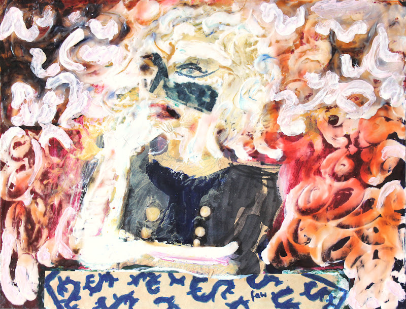
gambler ~ frank waaldijk
gambler (own work, 1982-2013, 64 x 91 cm, click on the image for an enlargement)

the original painting `the gambler in the city' (see below) was made in 1982, when i was still in high school. i had just returned from a one-year exchange program in minnetonka, minnesota (1981-1982). before starting in minnetonka high school i had already decided that i wanted to become an artist. therefore i took all sorts of classes that weren't available in my dutch high school (vwo science), like oil painting, lettering and calligraphy, photography, film. since the classroom for oil painting was open all day, i spent about two hours a day in there, for a year, taught by my wonderful teacher richard cunningham. he, being impressed with my work and dedication, pushed me to apply for an art academy grant in the united states, but i wished to go home.

at home in the netherlands i didn't have a studio, and nowhere the necessary finances to use oil paint. i just was drawing all day and making sculptures, and then i decided to use cheaper outdoor paint for painting. in the painting you can see that i was already then fascinated by ways of depicting faces in a non-standard manner. picasso was a great inspiration for me, although i never became a real cubist.

but i was never really satisfied with the painting, the left-hand side was unconvincing and the colours weren't really what i wanted. however, for being 17, i was still happy with having painted such a face at all, and to develop my skills in any way possible. then a dear friend of mine took a liking to the painting, and for more than 25 years it stood or hung somewhere in his apartment. this was largely a boon, since some other works from that period have been lost over time, but the downside was that i never got around to really finishing it. a few years ago he returned it, saying he had lost his enchantment, partly due to its state of deterioration. this was not hard to understand. the painting had lost its lustre, the paint had faded and accumulated dirt/dust, and in my eyes it never was a very good painting to begin with, except for the face.
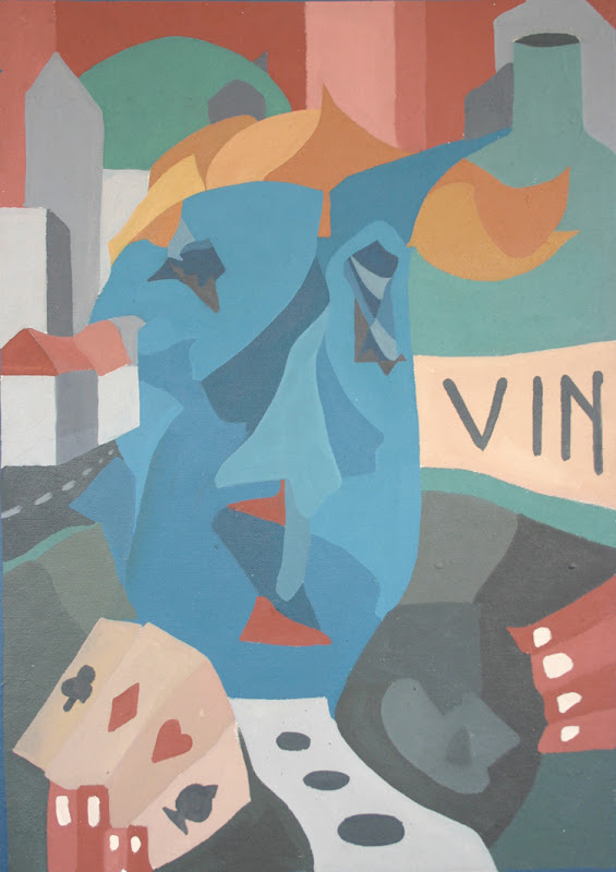
the gambler in the city~ frank waaldijk
the gambler in the city (own work (now lost due to reworking), 1982, 64 x 91 cm, click on the image for an enlargement).

so i told my friend: `i will restore the painting, but it will become very different. i will restore the lustre, but i also have to improve everything, from composition to colour etc., yet at the same time i want to retain its basic quality, if possible.' for the past 3 years i have been slowly working on a remake, the finished result which you see above. i found it hard to retain the buildings, their integration was already a problem when i started the painting. so i decided to simplify, and portray a gambler amidst another major addiction: alcohol.

all in all it was a painstaking process. nowadays i usually paint very differently, and i finally decided to blend the two styles, but this is not so easy as one might think. the result however gives me joy: i feel i have finally finished the original painting in the way it deserved to be finished.

[ps: by the way, my canon refuses to capture the colours of `gambler' anywhere close to accurately. it remains frustrating how badly affordable technology manages to handle colours. not only cameras, but computer screens as well. and many many people don't even notice. isn't that something...as an artist i'm always trying to achieve colour depth, colour life, colour tensions, colour harmonies. but who really notices? i like to think that some of my efforts go a long way with some people. it is probably too optimistic to expect that many people would notice.]

Monday, September 16, 2013

restoring old work: some examples

eva ~ frank waaldijk
eve (own work, 1986, 40 x 50 cm, click on the image for an enlargement)

this painting was made with a variety of paints, some pieces of tape and candle wax. i restored the bright red (which had deteriorated) and cleaned the rest. i especially like the expression and experimentation in this work. eva is the dutch name for eve.

horses, trees ~ frank waaldijk
horses, trees (own work, 1985, 25 x 47 cm, click on the image for an enlargement)

this work was made with thick gouache on cardboard, partly pressed straight out of the plastic container. in drying, the heavy cracking of the gouache leads to entire pieces falling off the cardboard. also the colours were somewhat faded. i reglued everything by varnishing with acrylic medium, which also restores some of the colour.

untitled ~ frank waaldijk
untitled (own work, 1989, 10 x 19 cm, click on the image for an enlargement)

this work was made on plasterboard, with ink and toothpaste. the paper had discoloured, and the ink had faded. the toothpaste, like the gouache above, threatened to fall off. i restored the original colour somewhat by painting, and replenished some ink, and finished with an acrylic varnish. then i mounted the result on a clear acrylic plate, as a frame which shows the plasterboard as well.

Friday, September 13, 2013

finishing and/or restoring old work: boon & bane

smokester ~ frank waaldijk
smokester (own work, 1989-2013, 23 x 31 cm, acrylic and mixed media on paper, click on the image for an enlargement)

finishing and/or restoring old works to me is both boon and bane. the boon of finishing old work lies partly in discovering that i have reached new levels of artistry, which enable me to find solutions where previously i got stuck. the boon of restoring old work partly lies in discovering that i still appreciate many older works, often also for their directness and unconventionality. some of them were made with not-so-durable materials, leading to fading colours or browning paper. and then it is a real pleasure to see these works restored.

the bane however is not small either. the finishing of old work is especially time-consuming, restoring old work is less so but still costs time and focus which i could also spend on developing truly new avenues.

and i really need to explore new avenues. this i will elucidate also in posts to come. (to be continued)

ps: in this old work you can find my signature initials `faw' on the front. nowadays i usually sign my work on the back side, still using `faw'. the reason for this is that i mostly find the signature to be a disturbing element. in this work `smokester' i managed to blend the signature in with the tablecloth pattern, which goes to show that i was having trouble with signing on the front already then. the work was made using quite an amount of toothpaste, which i used to buy in quantity and then squeeze directly from the tube onto canvas or paper.

Wednesday, September 11, 2013

Recuerdos de Tenerife (paintings series of the Canary Islands)

recuerdos de tenerife ~ painting by frank waaldijk
recuerdos de tenerife (own work, 2013, 60 x 80 cm, acrylic and mixed media on canvas, click on the image for an enlargement)

The Canary Islands continue to inspire me. Last February we visited Tenerife, and with a feeling of nostalgia I painted the above. Yes, the title borrows of course from the incomparable guitar piece `Recuerdos de la Alhambra' composed by Francisco Tárrega.

Another motivating factor was my wish to paint the beauty of `simple' foliage. I'm always enthralled by plants, and can look at them for hours and hours. An artist is truly insignificant when it comes to creating beauty, for nature is the true master, I feel.

Tuesday, September 10, 2013

outsiderness & photoshop experiments

my drawing "outsider" is being used in various places on the internet, by people wishing to illustrate the feeling of outsiderness. all without asking permission [copyrights apply], but mostly with appropriate reference to this blog, which i insist on since it is hard enough to garner some recognition as an artist. however, to see people using my drawings to bring across some emotion is a special form of recognition, which i greatly appreciate. i have been considering for some time now to release a body of work to wikimedia commons, so that people can use my drawings more freely. but i have not yet studied the consequences in enough detail.

the theme of outsiderness keeps intriguing me [you can click on the label "outsiderness" below this post to see other posts on this theme].

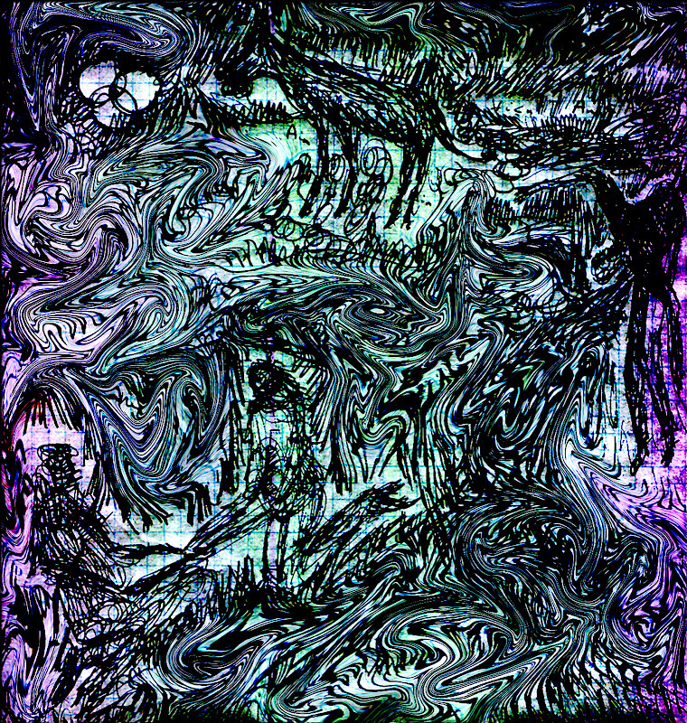
self-portrait in outsider forest~ frank waaldijk
self-portrait in outsider forest (own work, 2012-2013, 21 x 21 cm, digital, click on the image for an enlargement)

i'm experimenting, in many ways. the combination of photoshop with `ordinary' drawing fascinates me, but seldom leaves me satisfied. but things are progressing, slowly. i'm extremely hampered by rsi (repetitive strain injury), which has been plaguing me for the past 12 years. the reason also why my blogging activity is limited.

night encounter ~ frank waaldijk
night encounter (ongoing own work, 2007-2012, 21 x 22 cm, digital, click on the image for an enlargement)

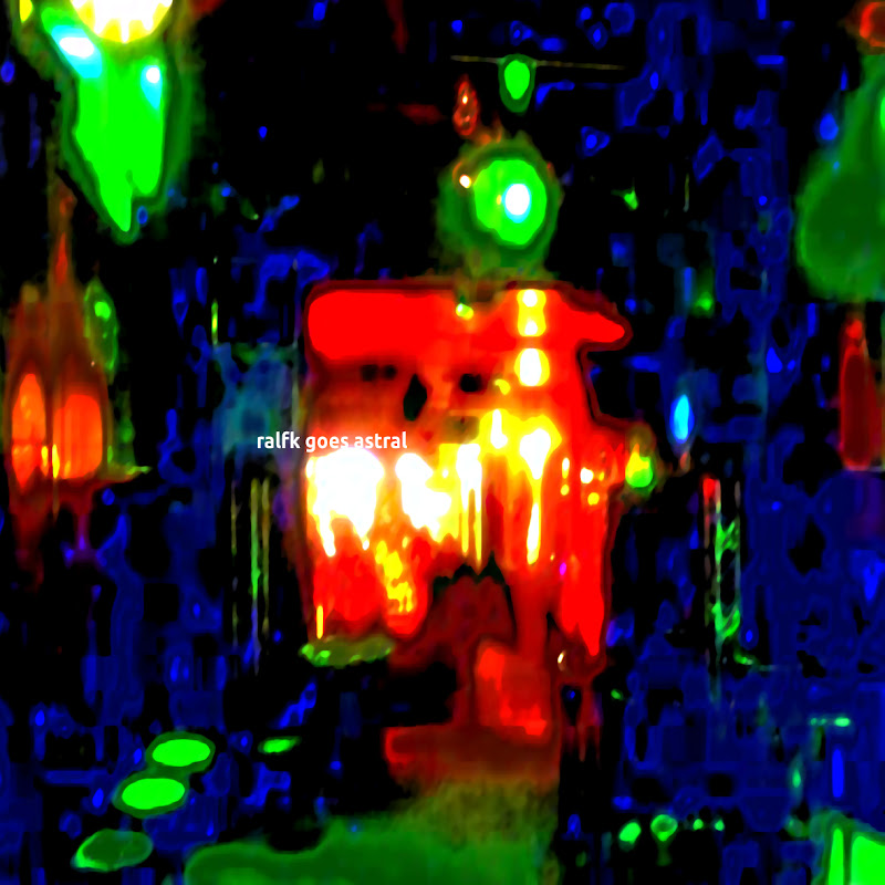
finally then, i designed another record sleeve for my friend and fellow artist ralf kwaaknijd, who is also an active musician.

ralfk goes astral ~ frank waaldijk
ralfk goes astral (2012, 35 x 35cm, digital, click on the image for an enlargement)

Tuesday, January 1, 2013

new year's wish to all

new year's wish 2013 ~ frank waaldijk

(click on the image for an enlargement)

Monday, December 3, 2012

again drawings (6): pine valley in painstaking line strokes

pine valley ~ frank waaldijk
pine valley (own work, 2007, 21 x 30 cm, click on the image for an enlargement)

pine valley ~ frank waaldijk
pine valley (detail 6.7 x 9 cm, click on the image for an enlargement)

one reason for adding the detail: it might give an inkling how many lines this one drawing took to complete. i find it interesting to note that this level of detailing inevitably leads to image files which are significantly harder to compress than average photgraphs. in the case of this drawing, the compressed .jpeg file is about 10 times as large as when compressing a normal photograph...showing how much information is packed in such a drawing.

oh, and i should add that the file (around 1.2 Mb) still doesn't do the real drawing much justice.