Showing posts with label drawing. Show all posts

Saturday, October 18, 2014

art appreciation, a study after van gogh, and an old rotring-pen drawing

study after van gogh, frank waaldijk
study after van gogh (own work, 2013, 30 x 21 cm, click on the image for an enlargement)

always drawing, always thinking... i also share some other artistic characteristics with van gogh. like lack of artist recognition :-). [van gogh was very avant-garde, i'm just plain old-fashioned (except in the `details'): painting, drawing, sculpting.]

seriously, after having had three exhibitions this year, i find myself wondering once again what it takes to get people interested in art? it hardly seems to matter how hard it is and how long it takes to achieve a certain artistic mastery, it seems to be all about `buzz' (generalized page rank...see previous posts).

with just little recognition, at times i find it difficult to keep up my motivation to go further, work harder, push beyond my current limits. but on the other hand, i find the work to be its own reward and its own recognition. there something special in having drawings that i made 30 years ago, and from every period in between till now, and see the development, see aspirations coming true.

horse, frank waaldijk
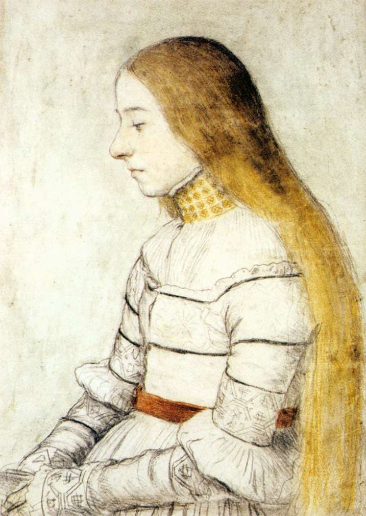
horse (own work, 1984, 20 x 30 cm, click on the image for an enlargement)

(this drawing i made with a rotring pen...and i'm still drawing with rotring pens over 30 years later.)

there is also some artistic merit in lack of recognition: it gives a lot of freedom, and quiet. especially the quiet i'm starting to appreciate more and more.

[a year ago i wrote on this subject also, see this post on frida kahlo. the downside to my dedicated-to-art blog seems that inevitably i repeat myself. i also have trouble highlighting other artists (much as i would like to!) since i'm always running behind with putting up my own work on the internet, due to health issues.]

Thursday, September 26, 2013

she sends her flamingos (finishing not so old work 2)

(when i get depressed) she sends her flamingos ~ frank waaldijk
(when i get depressed) she sends her flamingos (own work, 2008-2013, 21 x 30 cm, click on the image for an enlargement)

i have a fair number of unfinished drawings awaiting their turn for another attempt by me to bring them to a suitable conclusion. they lie around my studio in various places, and i look at them from time to time. there is no rhyme or reason to which one will grab my eye, at a certain point in time. but perhaps there is one pattern: some themes need time to settle. this differs from theme to theme.

as i have been writing about this here on this blog: at least one big challenge left for me is to explore human relations, and la condition humaine. as i grow older i find i'm even more disenchanted with superficial esthetics. poignancy, relevancy to real life, i'm looking for those.

one serious question is whether to cater to the general public's taste... i do not wish to create images just for myself, but if one wishes for poignancy, relevancy and non-superficiality, then it is a fair guess that the general public's taste will need time to catch up. at least as much time as i do, when creating the works. or perhaps of course my art is all rubbish :-)

just so you know where i'm coming from...

Thursday, September 19, 2013

finishing (not so old) work

grief and comfort v ~ frank waaldijk
grief and comfort (own work, 2012-2013, 34 x 50 cm, click on the image for an enlargement)

sometimes, a work takes more stages before it is finished than i expected. this is mostly the case when i'm really experimenting with style. one inner debate which almost always takes place is simplicity vs. subtility/sophistication. and a very related question: how much imperfection is called for in this work?

so after starting this drawing in the beginning of 2012, i thought it finished at the end of last year. but i always study finished works for some time in my studio, before storing them, and its imperfections kept consistently nagging at me. i know that imperfection has its own quality and necessity, but when it keeps nagging me i usually feel that i have to improve on the work. i this case i chose to work more on detail, colour and expression. effectively this changed the entire drawing. the three pictures of details below should show you the expressivity of hands, faces and last but certainly not least: the expressivity of abstract elements.

grief and comfort v hands~ frank waaldijk
hands in grief and comfort, detail i (click on the image for an enlargement)

grief and comfort v faces~ frank waaldijk
faces in grief and comfort, detail ii (click on the image for an enlargement)

grief and comfort v abstract detail ~ frank waaldijk
abstract elements in grief and comfort, detail iii (click on the image for an enlargement)


Tuesday, September 10, 2013

outsiderness & photoshop experiments

my drawing "outsider" is being used in various places on the internet, by people wishing to illustrate the feeling of outsiderness. all without asking permission [copyrights apply], but mostly with appropriate reference to this blog, which i insist on since it is hard enough to garner some recognition as an artist. however, to see people using my drawings to bring across some emotion is a special form of recognition, which i greatly appreciate. i have been considering for some time now to release a body of work to wikimedia commons, so that people can use my drawings more freely. but i have not yet studied the consequences in enough detail.

the theme of outsiderness keeps intriguing me [you can click on the label "outsiderness" below this post to see other posts on this theme].

self-portrait in outsider forest~ frank waaldijk
self-portrait in outsider forest (own work, 2012-2013, 21 x 21 cm, digital, click on the image for an enlargement)

i'm experimenting, in many ways. the combination of photoshop with `ordinary' drawing fascinates me, but seldom leaves me satisfied. but things are progressing, slowly. i'm extremely hampered by rsi (repetitive strain injury), which has been plaguing me for the past 12 years. the reason also why my blogging activity is limited.

night encounter ~ frank waaldijk
night encounter (ongoing own work, 2007-2012, 21 x 22 cm, digital, click on the image for an enlargement)

finally then, i designed another record sleeve for my friend and fellow artist ralf kwaaknijd, who is also an active musician.

ralfk goes astral ~ frank waaldijk
ralfk goes astral (2012, 35 x 35cm, digital, click on the image for an enlargement)

Monday, December 3, 2012

again drawings (6): pine valley in painstaking line strokes

pine valley ~ frank waaldijk
pine valley (own work, 2007, 21 x 30 cm, click on the image for an enlargement)

pine valley ~ frank waaldijk
pine valley (detail 6.7 x 9 cm, click on the image for an enlargement)

one reason for adding the detail: it might give an inkling how many lines this one drawing took to complete. i find it interesting to note that this level of detailing inevitably leads to image files which are significantly harder to compress than average photgraphs. in the case of this drawing, the compressed .jpeg file is about 10 times as large as when compressing a normal photograph...showing how much information is packed in such a drawing.

oh, and i should add that the file (around 1.2 Mb) still doesn't do the real drawing much justice.

Thursday, November 29, 2012

again drawings (2): notre dame des anges and hans holbein

notre dame des anges, hand on heart ~ frank waaldijk
notre dame des anges, hand on heart (own work, 2012, 30 x 21 cm, click on the image for an enlargement)

notre dame des anges in blue dress ~ frank waaldijk
notre dame des anges in blue dress (own work, 2012, 30 x 21 cm, click on the image for an enlargement)

woman texting on the bed at night ~ frank waaldijk
woman texting on the bed at night (own work, 2011, 30 x 21 cm, click on the image for an enlargement)

what could be an artist's motivation to draw, in such quantities too? being an artist used to be a living :-), which raises the possibility that drawing is a money scheme :-). there are those who like to demystify the great artists of the past in this way. one of those great artists in my eyes is hans holbein the younger. i have never seen any work of his which did not cause me to pause in my tracks. the drawing below was made in 1526, but looks as fresh and poignant as if made today.

the strikingly demure pose, the colouring, well everything really...goes to show that drawing is not a money scheme but a deep inner compulsion to express, to portray, to touch upon the world especially also in the non-visible layers, through visual means.


hans holbein the younger, portrait of anna meyer
hans holbein the younger, portrait of anna meyer (1526)

and what about letting yourself be portrayed in this fashion? does that not show deep respect for the artist?

Saturday, March 10, 2012

of human relations 3: drawings, drawings

[repeated: `as i said, i'm looking for new ways to visualize human relations, feelings, real-life struggle as well as uplifting moments. looking back on centuries of art, i find myself surprised that there is so little art which addresses this in a way that i find provoking, uplifting, inspiring.

this gives new motivation to continue my investigation. i feel sure enough of the emotive strength of the drawings which come up in this sense. and this translates into paintings as well. but enough words, the images themselves should be stronger.']

self-portrait as a mother worried about her children ~ frank waaldijk
self-portrait as a mother worried about her children (own work, 2012, 30 x 36 cm, click on the image for an enlargement)

rejection ~ frank waaldijk
rejection (own work, 2012, 21 x 20 cm, click on the image for an enlargement)

for the next image, also see the post on notre dame des anges:

seigneur notre retraite (in brown-red) ~ frank waaldijk
seigneur notre retraite (in brown-red) (own work, 2011, 30 x 40 cm, click on the image for an enlargement)

another theme that crops up ever more frequently: the people who do not fit well into our `wonderful' society. sure, they are the misfits, so to say. but who is the more crazy, he who accepts this crazy world, or he who does not fit in? if you have read my previous posts, you will know that i for one cannot simply answer that question. and my concern and sympathy are often with the misfits, and my anger is often directed at all the `respected' institutions which together comprise the status quo in our society.

woman out of kilter ~ frank waaldijk
woman out of kilter (own work, 2011, 20 x 28 cm, click on the image for an enlargement)

i think emotive expressive power comes from the eyes, the face, the body language...and the materials and techniques used. this is what i study on, laboriously, and much unappreciatedly...but the time of appreciation will come, i suppose, once enough people see the works and enough time has passed for them to compare this avenue of art to other avenues. anyway, if you see any art touching on the same themes, please let me know, since it would be inspiring to me to know other artists with a similar outlook.

detail of woman out of kilter ~ frank waaldijk
detail of woman out of kilter (own work, 2011, 20 x 28 cm, click on the image for an enlargement)


taking care of the psychiatric patient iii ~ frank waaldijk
taking care of the psychiatric patient iii (own work, 2011, 21 x 30 cm, click on the image for an enlargement)


grief and comfort iii ~ frank waaldijk
grief and comfort iii (own work, 2011, 21 x 30 cm, click on the image for an enlargement)


self-portrait in orange unrest ~ frank waaldijk
self-portrait in orange unrest (own work, 2011, 21 x 30 cm, click on the image for an enlargement)


man, lost in thoughts and orange background ~ frank waaldijk
man, lost in thoughts and orange background (own work, 2011, 30 x 36 cm, click on the image for an enlargement)

st. frances posing ~ frank waaldijk
st. frances posing (own work, 2011, 30 x 35 cm, click on the image for an enlargement)

woman in white bra ~ frank waaldijk
woman in white bra (own work, 2012, 30 x 40 cm, click on the image for an enlargement)

Thursday, January 27, 2011

some drawings (leading to self-reference)

this blog serves multiple purposes, which sometimes does not make for very consistent threads. the thread on nuclear energy has been served well enough, but a new thread (self-reference in art and other areas) will have to wait a little, since i also want to put up some fairly recent drawings...some of them containing a fair amount of self-reference...[and with real difficulty in getting the true colours of the real works approximately right, so i have to say the real works are really better (this is a plus too, of course, but readers of the blog often are not in a position to come view these drawings in the physical world)]

woman in park, frank waaldijk
woman in park (own work, 2008-2011, click on the image for an enlargement)


self-portrait as artist who cannot even draw, frank waaldijk
self-portrait as artist who cannot even draw (own work, 2010, click on the image for an enlargement)


notre dame des anges texting, frank waaldijk
notre dame des anges texting (own work, 2010, click on the image for an enlargement)


notre dame des anges with glasses, frank waaldijk
notre dame des anges with glasses (own work, 2010, click on the image for an enlargement)


i think i met an angel, frank waaldijk
i think i met an angel (own work, 2010, click on the image for an enlargement)


self-portrait as artist with higher inspiration, frank waaldijk
self-portrait as artist with higher inspiration (own work, 2010, click on the image for an enlargement)

Friday, November 26, 2010

drawing, painting, drainting (st. frances 2)

portrait of st. frances drawing, drawing, own work
portrait of st. frances drawing, mixed media on paper (own work 2010, 20 x 30 cm, click on the image for an enlargement).

compared to the later work in the 20 november post, this one is more direct, less refined, but that is not to say less expressive. [disclaimer: drawings' colours and fine details are hard to photograph]

this drawing can also still be considered a drainting...but has more obvious drawing elements than (oh let me just repeat it, that is easier:) the later work below:

st. frances drawing, drawing, own work
st. frances drawing, mixed media on paper (own work 2010, 20 x 30 cm, click on the image for an enlargement).
$$$$$$$$

now to start a thread on the shady distinction between painting and drawing, first a wikipedia entry:
Drawing is a form of visual expression and is one of the major forms within the visual arts. There are a number of subcategories of drawing, including cartooning. Certain drawing methods or approaches, such as "doodling" and other informal kinds of drawing such as drawing on a foggy mirror caused by the steam from a shower, or the surrealist method of "entoptic graphomania", in which dots are made at the sites of impurities in a blank sheet of paper, and lines are then made between the dots, may or may not be considered as part of "drawing" as a "fine art." Likewise tracing, drawing on a thin piece of paper, sometimes designed for that purpose (tracing paper), around the outline of preexisting shapes that show through this paper, is also not considered fine art, although it may be part of the draughtsman's preparation.

The word 'drawing' is used as both a verb and a noun:

* Drawing (verb) is the act of making marks on a surface so as to create an image, form or shape.
* The produced image is also called a drawing (noun). A quick, unrefined drawing may be defined as a sketch.

Drawing is generally concerned with the marking of lines and areas of tone onto paper. Traditional drawings were monochrome, or at least had little colour,[1] while modern coloured-pencil drawings may approach or cross a boundary between drawing and painting. In Western terminology, however, drawing is distinct from painting despite that similar media are often employed in both tasks. Dry media, normally associated with drawing, such as chalk, may be used in pastel paintings. Drawing may be done with a liquid medium, applied with brushes or pens. Similar supports likewise can serve both: painting generally involves the application of liquid paint onto prepared canvas or panels, but sometimes an underdrawing is drawn first on that same support. Drawing is often exploratory, with considerable emphasis on observation, problem solving and composition. Drawing is also regularly employed in preparation for a painting, further obfuscating their distinction.

this entry already shows that the disciplines of drawing and painting are not so easily separated.

Saturday, November 20, 2010

some drawings of this year 2

some more drawings, without too much commentary (today, maybe i'll add something more later on).

[[repeated from a previous post: i'm always drawing...drawing to me is like poetry, and it is definitely a continuous source which pours over to painting. enough said, i'm just going to put up some pictures. (you can click on them for larger images.).

by the way, i invariably find drawings to be difficult to photograph well, my cameras nor my scanner are able to handle the contrasts and subtle whites and tonings that typically occur in a drawing. so although i put in quite some effort, the result is not as accurate as i would like it to be.]]

st. frances drawing, drawing, own work
st. frances drawing, mixed media on paper (own work 2010, 20 x 30 cm, click on the image for an enlargement).

[later comment 26 nov 2010:] this drawing is the latest in a series of st. francesca of rome (`st. frances drawing'). i worked on this drawing for 5 months, off and on. in fact, the word `drawing' becomes a bit questionable in many of my works on paper, because many of these works can also be seen as painting. perhaps the most accurate description would be `drainting' (since `pawing' has quite a different connotation already ;-)). let's google `drainting'! ...ok, having done so, as expected this observation and these puns have already been made by fellow artists...! but i will merit this discussion with another post. check out my posts for 26 november.


caught up in circles, drawing, own work
caught up in circles, mixed media on paper (own work 2010, 20 x 30 cm, click on the image for an enlargement) [from the lyrics of cyndi lauper's `time after time'].

[26 november:] i'm working on putting my figures in some space. spatiality never was my strongest point, and starting out i didn't consider spatiality to be very important. a bit like paul klee perhaps. nowadays i'm puzzling on the question whether to devote more energy on achieving spatiality, or to continue to search for spiritual expression through other means, or...a combination, which is perhaps impossible. my problem with spatiality is that it already confers a touch of realism, and realism -its merits notwithstanding- has the decided disadvantage of taking the state of being as its foundation. all art derived from realism actually does this. so perhaps almost art does this, and it is the distance to / distortion of reality that determines whether something is classified as `realistic'. however, the above drainting will not be considered realistic by most viewers. still, it is based on realism nonetheless.

the question also is: why not content oneself with the state of being as an artistic foundation? or even as a spiritual foundation? to me there is also some inner world -perhaps childlike, primitive,...primordial, primogenial,...; perhaps not- which strives for expression. by using spatiality techniques (from the strange endeavour of creating 2D-works representing (3D-elements of) a 3D-world) one already puts a large restraint on the expression.

anyway, this is a hard question for me, and i will not be able to provide any real answer, i'm afraid. `caught up in circles, confusion is nothing new' applies here too. a very nice song...`if you're lost you may look and you will find me, time after time // if you fall i will catch you, i'll be waiting...time after time'

caught up in circles, detail of drawing, own work
detail of the above drawing

Monday, February 2, 2009

entombment series inspired by rembrandt 10, 11 (end)

frank waaldijk, entombment 10 (inspired by a rembrandt drawing)

entombment 10 (own work, 2006, 70 x 50 cm, inspired by a rembrandt drawing)


frank waaldijk, entombment 11 (inspired by a rembrandt drawing)

entombment 11 (own work, 2006, 70 x 50 cm, inspired by a rembrandt drawing)

above are the last two drawings in the series, no further comment on them. i hope to have brought readers some insight in how works develop over time, and how old masters inspire. now it's time for other subjects.

entombment series inspired by rembrandt 8, 9

frank waaldijk, entombment 8 (inspired by a rembrandt drawing)

entombment 8 (own work, 2006, inspired by a rembrandt drawing)

continuing from the previous post. from here on i feel the theme has reached the level that i'm looking for. detail below:

frank waaldijk, detail of entombment 8 (inspired by a rembrandt drawing)

entombment 8 (detail, own work, 2006, inspired by a rembrandt drawing)

the next drawing really comes from the subconscious levels, i honestly have no idea how this type of drawing comes into existence, it just happens.

frank waaldijk, entombment 9 (inspired by a rembrandt drawing)

entombment 9 (own work, 2006, 50 x 35 cm, inspired by a rembrandt drawing)

and a detail:

frank waaldijk, detail of entombment 8(inspired by a rembrandt drawing)

entombment 9 (detail, own work, 2006, inspired by a rembrandt drawing)

Saturday, January 24, 2009

entombment series inspired by rembrandt 5, 6, 7

frank waaldijk, entombment 5(inspired by a rembrandt drawing)

entombment 5 (own work, 2006, inspired by a rembrandt drawing)

continuing from the previous post. it is probably more prudent from the marketing perspective to not show less-than-perfect studies, but so what. i thought it might be interesting to show a bit how themes develop, and in all my themes there are a fair percentage of works that don't `work' enough on the levels in which i'm interested.

from this point on the format in the series is no longer only a4 (21 x 30 cm).

frank waaldijk, entombment 6(inspired by a rembrandt drawing)

entombment 6 (own work, 2006, 45 x 35 cm, inspired by a rembrandt drawing)

frank waaldijk, entombment 7(inspired by a rembrandt drawing)

entombment 7 (own work, 2006, 40 x 50 cm, inspired by a rembrandt drawing)

Sunday, December 28, 2008

just let me be the dog at your party

frank waaldijk, just let me be the dog at your party

just let me be the dog at your party (own work, 2008, 21 x 30 cm, mixed media on paper)

been sick for days with a heavy cold. nothing to do but lie in bed, write posts on this blog and...yesterday's drawing.