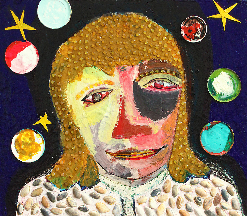
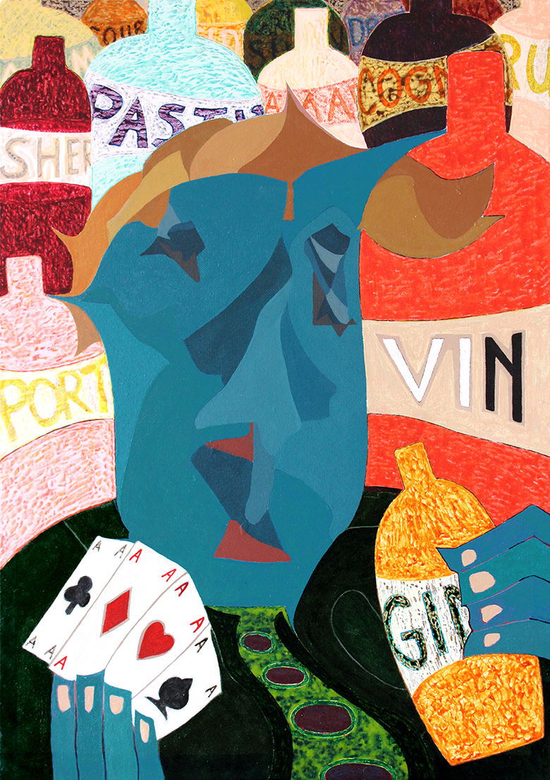
 gambler
 (own work, 1982-2013, 64 x 91 cm, click on the image for an enlargement)
the original painting `the gambler in the city' (see below) was made in 1982, when i was still in high school. i had just returned from a one-year exchange program in minnetonka, minnesota (1981-1982). before starting in minnetonka high school i had already decided that i wanted to become an artist. therefore i took all sorts of classes that weren't available in my dutch high school (vwo science), like oil painting, lettering and calligraphy, photography, film. since the classroom for oil painting was open all day, i spent about two hours a day in there, for a year, taught by my wonderful teacher richard cunningham. he, being impressed with my work and dedication, pushed me to apply for an art academy grant in the united states, but i wished to go home.
at home in the netherlands i didn't have a studio, and nowhere the necessary finances to use oil paint. i just was drawing all day and making sculptures, and then i decided to use cheaper outdoor paint for painting. in the painting you can see that i was already then fascinated by ways of depicting faces in a non-standard manner. picasso was a great inspiration for me, although i never became a real cubist.
but i was never really satisfied with the painting, the left-hand side was unconvincing and the colours weren't really what i wanted. however, for being 17, i was still happy with having painted such a face at all, and to develop my skills in any way possible. then a dear friend of mine took a liking to the painting, and for more than 25 years it stood or hung somewhere in his apartment. this was largely a boon, since some other works from that period have been lost over time, but the downside was that i never got around to really finishing it. a few years ago he returned it, saying he had lost his enchantment, partly due to its state of deterioration. this was not hard to understand. the painting had lost its lustre, the paint had faded and accumulated dirt/dust, and in my eyes it never was a very good painting to begin with, except for the face.
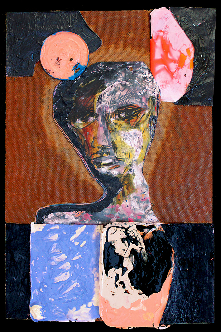
 the gambler in the city
 (own work (now lost due to reworking), 1982, 64 x 91 cm, click on the image for an enlargement).
so i told my friend: `i will restore the painting, but it will become very different. i will restore the lustre, but i also have to improve everything, from composition to colour etc., yet at the same time i want to retain its basic quality, if possible.' for the past 3 years i have been slowly working on a remake, the finished result which you see above. i found it hard to retain the buildings, their integration was already a problem when i started the painting. so i decided to simplify, and portray a gambler amidst another major addiction: alcohol.
all in all it was a painstaking process. nowadays i usually paint very differently, and i finally decided to blend the two styles, but this is not so easy as one might think. the result however gives me joy: i feel i have finally finished the original painting in the way it deserved to be finished.
[ps: by the way, my canon refuses to capture the colours of `gambler' anywhere close to accurately. it remains frustrating how badly affordable technology manages to handle colours. not only cameras, but computer screens as well. and many many people don't even notice. isn't that something...as an artist i'm always trying to achieve colour depth, colour life, colour tensions, colour harmonies. but who really notices? i like to think that some of my efforts go a long way with some people. it is probably too optimistic to expect that many people would notice.]


