Tuesday, January 11, 2011

monarchy & vpro continued 2 (more digital design)

you really should read the previous post first, if you wish to understand the designs in this post...but one element needs to be added: the colour orange is our national colour, because...of prince william of orange, who fought against the spanish rule in the 16th century. since then, our monarchs, who only vaguely descend from this william, are called `de oranjes' (the orange ones). so you understand why the colour is used so much in these designs...

and i'm just making a small selection from http://weblogs.vpro.nl/cover1/inzendingen2010/, with little comment.

design frank dennissen, VPRO Gids Cover 1, 2010
design by frank dennissen, VPRO Gids Cover 1, 2010

design opmaak 1, VPRO Gids Cover 1, 2010
design by opmaak 1, VPRO Gids Cover 1, 2010, the text reads: `will you save the monarchy? you decide who must leave the arena. so text The Name to 2010"

design tim juffemans, VPRO Gids Cover 1, 2010
design tim juffemans, VPRO Gids Cover 1, 2010 (click on the image for an enlargement, it contains references to a number of controversies surrounding the royal family, including a holiday resort in mozambique [see the machangulo affair on wikipedia], and the shot (dutch) lion is the topping...)

design frank voors, VPRO Gids Cover 1, 2010
design by frank voors, VPRO Gids Cover 1, 2010 (bernhard was a notorious lover of fast cars...)

design sanne van dragt, VPRO Gids Cover 1, 2010
design by sanne van dragt, VPRO Gids Cover 1, 2010

design basic cmyk, VPRO Gids Cover 1, 2010
design by basic cmyk, VPRO Gids Cover 1, 2010

design print, VPRO Gids Cover 1, 2010
design by print, VPRO Gids Cover 1, 2010

&&&&&&

there were more designs which i thought were compelling, including some very nice drawings:

design jasper rietman, VPRO Gids Cover 1, 2010
design by jasper rietman, VPRO Gids Cover 1, 2010 (click for an enlargement, worth the trouble)

and a drawing with no real message that i could see, but which i just like very much as a drawing depicting `typically dutch' stuff:

design dominique pattipawaij, VPRO Gids Cover 1, 2010
design by dominique pattipawaij, VPRO Gids Cover 1, 2010

my own design will follow in the next post (i certainly don't consider it to be the best, i just like to present it and explain a little).

more vpro cover, prince bernhard, art in our merchant society, monarchy (digital design)

oh well, i'm still not done. in 2010 i also participated in the vpro cover design contest, the theme then was: `monarchy'. but, as was explicitly stated, the main reason for this theme was the new television series to be aired by the vpro, called `bernhard, scoundrel of orange' (`bernhard, schavuit van oranje') about the life of prince bernhard, husband of our former queen juliana.

prince bernhard was severely compromised in the '70s for accepting bribes from lockheed and other parties, in his role as military adviser to the government. he also fathered two extra-marital children. before the war he was a member of the nsdap and the reiter ss, which he first denied and when confronted with paper evidence he claimed to have been made member without his knowledge (although contribution was paid promptly and meticulously for years). also he was already a member of the deutsche studentenschaft from 1932-1934 with an application form filled out in his own handwriting (the studentenschaft was also clearly nationalsozialistisch -in other words nazi).

when caught in the bribery act, he was -naturally- facing indictment and trial. however, queen juliana said she would abdicate if her husband was put on trial and daughter beatrix (our current queen) said she would not take up the throne in this way.

so...what do you think happened? i was 11 yrs old at the time and i still feel the indignation of what our government concocted. they decided to not put bernhard on trial, to save the monarchy. if you even think bernhard had to pay back the money, you are wrong. his punishment consisted of stripping him of his military uniform in public appearances and relieving him of his advisory function. wow. any `common' shoplifter or thief is treated with harsh justice, for let's say a couple of thousand at the most, but when it comes to millions, the high society protects itself...

these are not the only scandals and controversies surrounding bernhard. read for yourself on wikipedia: prince bernhard von lippe-biesterfeld.

so you can imagine this theme also caught my attention. we are a so-called democracy, but still our monarch has some not unimportant political functions. a strange state of affairs. monarchs' succession is by birthright, so it must be that some special status is accorded to `being the child of'. still, our future king willem alexander married maxima zorreguieta. she is the daughter of jorge zorreguieta, (civilian) member of the argentine military junta of jorge videla, which was responsible for the calculated murder of thousands of dissident civilians from 1976-1983 (in the so-called dirty war).

i am the first to state that children bear no automatic responsibility for the actions of their parents, and i have nothing against maxima, but in this case i find it extremely unacceptable for our future king to be wedded to her. ok, they should have married, let love prevail, but then let someone else take the throne. if anything good can be ascribed to monarchy, it should be about representation, about making the right choices. what message do we give to all the bereft argentine mothers, fathers, children, who saw their beloved taken away in the night never to return?

from wikipedia:
The news of the couple's relationship and eventual marriage plans caused controversy in the Netherlands. Máxima's father had been the Minister of Agriculture during the regime of former Argentine President Jorge Rafael Videla, a military dictator who ruled Argentina from 1976 to 1981 and who was responsible for many atrocities against civilians (An estimated 10,000–30,000 people disappeared during this and subsequent military regimes before democracy was restored to Argentina in 1983). Jorge Zorreguieta claimed that, as a civilian, he was unaware of the Dirty War while he was a cabinet minister. Professor Baud, who on request of the Dutch Parliament did an inquiry in the involvement of Zorreguieta, concluded that would it have been unlikely for a person in such a powerful position in the government to be unaware of the Dirty War.[1]

in order to understand all the designs that were sent to the vpro for this `monarchy' theme, i should fill pages...but you get the drift of what lies beneath the surface of our happy orange household...

but one big benefit of our monarchy usually remains underexposed: the entertainment value. several gossip magazines rely almost exclusively on our royal family for their existence. if the queen plus entourage get a salary of millions of euro's, this may seem large, but divided by our population it yields an attractive per capita amusement tax [added later: the cost of the royal family turns out to be the staggering figure of 114 million euros per year, where i thought it would be 10 million max. incredible.]. therefore i would advise all other civilized countries to reinstate monarchy if they haven't been able to maintain one over the centuries!

in this spirit, one of the best designs for the 2010 vpro cover i thought was the one below by teun van den wittenboer (if teun or vpro object, please let me know and i will remove the image, although it can be seen at the link above):

design teun van den wittenboer, VPRO Gids Cover 1, 2010

the text reads: "the -up 'till now hidden- second tattoo of bernhard".

you might wonder what i find so brilliant about this...but i think the image is perfectly executed, and i also consider the idea to be a brilliant mockery of what we dutch think of as important in life...the exterior body, and silly secrets. we do not take the time to ponder the real implications of our monarchy, instead we are fascinated by gossip-magazine items and glitter and glamour.

the jury -as expected somewhat i must say, since i have now seen more years of designs and jurying- did not spot this design, it seems. the winning design was -contrary to my expectations which were obviously too high- a very non-committal silhouette of our queen, nothing more. well, no controversy there, a very safe choice! but not really in concordance with the original commission if you ask me. and for me it also raises the question of how critical our television broadcasting associations really are. i hope we will not drift towards an italian situation, where television is largely mind-numbingly stupid entertainment.

we need critics! we need people who dare speak out against superficiality and money/power/sex as a sole goal in life. so i hope the vpro will continue to orient itself towards such a critical role.

anyway, the jury did pick out the following design by michelle sipers, which i also think is very good (see the above remark about removing the image):

design michelle sipers, VPRO Gids Cover 1, 2010

i will perhaps pick out some more designs in the next post.
Monday, January 10, 2011

100,000 visits to this blog

well, not so much perhaps when compared to really well-visited sites, but surprising to me nonetheless! and i'm glad that what i put up here reaches a lot of people (although i get little feedback as to what they think of it ;-)), this is added motivation (although i would write for a few people just as well, but it does give the feeling that the (relatively new) internet really gives a new platform to people like me). thanx to all readers!

nuclear energy (vpro cover, digital design) continued

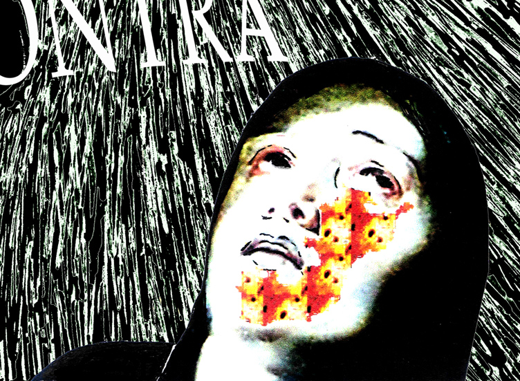
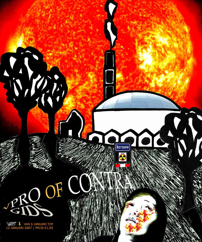
i would like to describe where the previous design came from (let me repeat it below for best reading, design for the january 2007 vpro cover, click on the image for a large enlargement)

v-pro of contra, design frank waaldijk, VPRO Gids Cover 1, 2007

some elements:

in 1982 in my final year in high school i made a cynical postcard `greetings from kalkar'. at the time there were plans for a nuclear plant in kalkar, and i was very much against. the card was meant as a cynical depiction of how a nuclear plant could (never) be a touristic feature...

however, strangely enough, the plans were ultimately cancelled, leaving the already constructed outer building with no clear purpose. in the nineties, this building was converted in a water-based attraction park for recreation, and called kernwasser wunderland, today the park is called wunderland kalkar...and what once was a cynical postcard now is simply touristic reality...incredible, isn't it?

greetings from kalkar, frank waaldijk 1982

cooling tower used as climbing wall in wunderland kalkar

you can see how i used elements from the postcard in the vpro design...

%%%%%%%

for dramatic effect, i also used a figure from a painting by rubens (but since a computer crash, i have been unable to refind the original painting from which this figure was taken...i've tried searching for it with google, but to no avail.

the direction of looking of the original figure was dramatically upward (far more so than in this design), i photoshopped until the face had the right expression. then i also added a radiation burn pattern on the face...because in my not so humble opinion we are taking an extremely unfair risk with regard to future generations.

detail rubens, vpro design frank waaldijk, 2007

&&&&&&&

in the background, the dramatic picture of the sun is actually a depiction of a much safer form of nuclear energy: fusion. both solar energy and possibly in the future nuclear energy from fusion are far more sustainable than our current nuclear plants imnsho.

in the foreground, i have tried to recreate the old photographic effect of solarisation (arising from overexposure of negatives in a certain way):

detail solarisation, vpro design frank waaldijk, 2007

&&&&&&&

to clarify the borssele connection, i added this element in the standard design of dutch town limits:

detail borssele, vpro design frank waaldijk, 2007

then of course the lettering: the commission always states to leave out the lettering and the vpro logo. but in this case i did not have much faith in the vpro's own layout, and also i wanted to sharpen the theme by adding `vpro or contra'.

*******

so, there you have the different layers of the design all spelled out...perhaps you can understand why i am still very contented with this design, perhaps not.

*******

to finish, another design which i thought was `cool'...;-) by judith van meeuwen [there were many other cool designs, unfortunately the vpro has removed the higher resolution pictures and this is the best i can offer; if judith or vpro object to my reproducing it here, please let me know and i will remove it]:

new energy, vpro design judith van meeuwen, 2007

it is a really mystifying, atmospheric design, which to me has all the intrigue of something we don't know about yet, and which is also clearly about energy.

Wednesday, January 5, 2011

nuclear energy, vpro cover, art in our merchant society (more digital design)

so in this thread (art in our merchant society, vpro cover competition, digital design) i would like to put up a design i made a few years back for the vpro cover competition. the theme given was: `new energy' and the explanation talked about the dilemmas facing our society with regard to dwindling traditional energy supplies (oil, gas, coal). any design featuring this theme and /or this dilemma was welcome, also with an enthusiastic invitation to think of new forms of energy.

at the time an important decision had just been made by the (previous) dutch government regarding nuclear energy, namely to continue operating the nuclear plant in borssele until 2033 (instead of closing it down in 2013, as was the earlier plan). the decision had been taken in june, but in november a new government had been elected, and public discussion about nuclear energy should have been priority in my not so humble opinion. the political debate was whether to create even more nuclear plants, to maintain status quo or to strive for elimination.

since then plans for a second nuclear plant in borssele have been developed. so before this, and in the backlight of this debate, i made the design below:

v-pro of contra, design frank waaldijk, VPRO Gids Cover 1, 2007

(my design for the january 2007 vpro cover, click on the image for a large enlargement)

&&&&&&

before talking about the design in particular designerspeak (if i'm even capable of that...), i'd like to note that there were -as usual- many wonderful designs. i do not envy a jury! but given the fact that energy is a serious societal problem, i somehow would expect that designs focusing on the problematic side of the commission would also get some attention. in my recollection, the jury picked almost exclusively `light' designs.

well, like i said, don't expect me to be any better in picking nominees or winners...! but to grumpy old me, this perceived favouritism for `light' (funny, easy to grasp, nudge nudge, tongue-in-cheek) designs seems a bit symptomatic of the underestimation in the netherlands of visual art, and of the importance of having a good visual training/education, perhaps i should call this "imagery education".

because an image speaks a thousands words.

much of what we think is governed by images, more than by words. if i want to know if you have understood something, what will i ask most frequently? i believe this to be the question: "you see?".

$$$$$$

but in our merchant society, we have degraded art education in our secondary schools to a very unimportant position. we have made mathematics compulsory for all years of secondary school, as well as foreign languages (merchant merchant!). but we neglect to educate values, emotions, clear thinking, artisticity, creativity, criticism, ...all necessary elements for a culturally and economically thriving society, which also can take its responsibility when it comes to long-term decisions affecting the well-being also of future generations.

can we put a price on being able to live in a non-polluted environment? can we trade the extinction of the whale against a 5 ct reduction in the price of bread? can we trade the cost of war in afghanistan and iraq against the funds necessary to help people starving or struck by natural disaster? ...apparently we can. but future generations will hold us responsible, and rightly so.

and this is what artists can and do tackle, and do try to attract attention to. with images and imagery that cannot be ignored (if the artist is worth her/his salt AND if the merchant mentality in society is not completely dominant).

[wow, frank in rant mode...to be continued, since i forgot to talk about the design in designerspeak -which i probably don't speak anyway, but...]

Tuesday, January 4, 2011

art in our merchant society 2 (more digital design)

[see also previous post! oh well, i'm careening a bit between two subjects (see the ambiguous title), sorry]

Klein_Marcel

marcel klein's design for the vpro cover competition (see previous post, not nominated by the jury - i take it for granted neither marcel nor vpro will mind my putting up this design on my blog, if so just let me know and i will remove it and replace it with just the link).

i like it for a couple of reasons. the somewhat strange composition, which works out lively and elegant. but also the sharp juxtaposition of `old' and `new' technology - paper cut-outs and computer-related cables - in the form of a tree...which is what paper is made of, usually...and what also constitutes a big argument against paper, namely wouldn't we want those trees to serve a better purpose?

moreover, notwithstanding the briefing from the vpro which contained some nostalgia about paper being on its return, as far as i know our paper consumption has not decreased since the ICT revolution, but on the contrary has increased...perhaps because we print out all those emails and memos and reports and all the try-out versions of these products too, i don't know.

so the image also describes this process: a lot of electronic communication ends in physical paper...

therefore: nice! - but not immediately classifiable as an ode to paper, you could say. does that really disqualify this design? i would say on the contrary, it lifts the original commission to a higher level.

(grumpy me: i'm not completely enthusiastic about the colours, and one could also point out that the branching out of one of the electronic-cable-branches is a bit obviously photoshopped, so be it)

anyway, i'm not saying this design should have won or should have been nominated, but in comparison to some of the nominated designs it is clear that the jury looks more to direct visual effect than to possible deeper layers.

it would in my not so humble opinion be a step forward if also designs that consider a more complex message would get serious reconsideration. not only in this competition, but in cover designs overall.

%%%%%%

however, in a merchant society, i believe that subtle and/or complex art is bound to suffer. time is money, after all! if i cannot grasp the meaning of something in a few seconds, then i might lose valuable opportunities elsewhere...plus of course that only the most blatant art will impress my newfound family of rich entrepreneurs who also seek to impress me with their blatant modern art collection...

obviously i speak not in absolutes, but i believe this to be the general prevailing mechanism in modern (or contemporary if you prefer) art. and this is judging by what i see in museums and galleries specializing in the `top' of contemporary art. (but you know my views on quality mechanisms, else search this blog for `quality' (without the single quotes this becomes a funny statement, but perhaps true too...)).

it all boils down to the question:

what is art for?

in a merchant society, you can imagine the most common reply. and this is then subsequently what drives our art market, our art institutions, and if we are very very unlucky our artists as well.

Monday, January 3, 2011

art in our merchant society (more digital design)

every year, the dutch broadcasting corporation vpro holds an open design competition for the cover of its first magazine of the new year.

a very inspiring idea!!

and one should really look at all the designs that people make, they are put on the vpro's website for cover 1. it is very inspiring to see what is being made by young and old, professional and non-professional.

of course, i would'nt be grumpy old me if i wasn't grumpy old me, so i also see quite a number of drawbacks to the way this competition is organized, but...it remains a nice and original idea! for many amateur/semi-amateur designers, where can one find a similar opportunity to create a design with (if you win of course...) national exposure?

which is partly why i like to participate, from time to time. not every year, because i often don't feel much affinity with the selected theme (like this year's theme: `ode to paper' - it just doesn't do much for me, because for me the direction has been predetermined too much. it would have worked better for me if it had been simply: `paper', but even that probably would not really have set me on fire, i suppose, much as i like paper as a medium and also as a material).

so far i have participated twice, with designs that i really like and which naturally failed to draw any attention from the jury...;-) but thankfully i have reached a stage where i understand that drawing attention from a jury is a very subjective affair, and also isn't the only thing that makes a design worthwhile.

but even if i don't participate, i usually take quite some time to look at the designs made by others, because it is really inspiring, like i said. from this i have noticed that my way of looking is rather different than the jury's...if i were to nominate 10 designs, in most years there would be not more than one or two overlaps with the nomination of the jury, and frequently none.

%%%%%%%

the next will sound arrogant, i know. but to me it sometimes seems as if really intelligent design is at a disadvantage. i have seen some excellent designs going unnoticed [yeah i know you could now laugh at me, but i'm not talking about my own designs ;-)], where the only reason for this that i could think of was that the idea behind the design was subtle, and took more than a short moment's reflection to grasp.

this brings us back (i think i discussed this earlier on this blog, but i'm not sure!) to the discussion on how `popular' art should be. the vpro prides itself on bringing programs that bring real content and culture, a deepening of background shall we say. therefore i think that it is a real sign of the times that even in the vpro-setting `intelligent' design is at a disadvantage.

to me it seems that we dutch are simply not motivated to invest time and effort in building our culture to the point where art, music, literature, poetry, film, etc. are appreciated as a valuable way to determine what values we treasure, what ways we should go and what ways we should not go with our society.

our new government is a very appalling example of the merchant mind which seems to dominate the netherlands. what a poor culture my country really has, is sometimes obscured by the many great painters which were born in the netherlands. but they are really just a strange exception to the dutch rule.

and it is also surprising that with such a merchant mentality, many eminent scientists also came from the netherlands. however, this latter phenomenon cannot persist i believe. whereas the natural talent for painting seems to be indigenous, to maintain a high level of science requires a definite non-merchant mentality. i'm sure we will see the downslide of dutch science in the decades to come. and we deserve it, for being so short-sighted and narrow-minded.

now who will be able to illuminate the blind? traditionally, i would say, it should be the artists (all liberal arts included). but in our merchant society, they are currently being put down as irrelevant (unless commercially successful) and as being basically parasitic on society - i'm NOT joking.

this is what happens when we vote for people who have no real cultural upbringing, no real cultural reflection, no basis for the insight that the arts are about everything that we hold dear. who can only think in terms of success, failure, money, power, fear, control,...you get the idea.

what does beauty mean to these people? what does colour mean? a song or a poem that brings the tears to one's eyes?

[to be continued]

Saturday, January 1, 2011

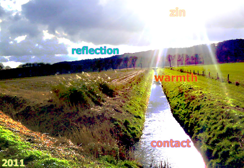
new year's wish to all


new year's wish

(click on the image for an enlargement)

`zin' is an essentially untranslatable dutch word, it means as many things as:

1. sense
2. meaning
3. mind
4. point
5. spirit
6. feeling
7. signification
8. inclination
9. gusto

Wednesday, December 8, 2010

more photoshopped pictures 2

tyres, own work
tyres (own work 2008, click on the image for an enlargement)

the thing is: imnsho an artist needs to receive inspiration from anywhere, everywhere. our encounter with our world (`reality') is a complex puzzle, ever changing, and somehow it is the artist's job to create meaningful interpretation, commentary, beauty, transcendentality even. pretty ambitious, really, so perhaps no wonder this often fails...

[don't let yourself be fooled by all the cheering and back-clapping and genius-proclaiming of galleries and museums...transcendental art is very rare, lastingly meaningful art is rare, good art is less rare but still already a relief...all imnsho of course. this doesn't mean that the work done by artists is mostly in vain, on the contrary. often very consistently hard work is necessary to reach occasional rare levels of art. it's just that we shouldn't try to put everything created by artists on a pedestal.]

House centipede (scutigera coleoptrata)
house centipede trapped in glass (duly released after the photoshoot, own work 2007-2008, click on the image for an enlargement)

[the above image comes from wikimedia commons, where i uploaded it on a free-use license...and lucky i did, because i seem to have deleted this particular edit of the original picture on my own computer...good to find this back-up! like i said i'm still pondering the avenue of uploading much more of my (art and photographic) works on wikimedia commons]

3 days of the condor, own work
3 days of the condor (own work 2008, click on the image for an enlargement)

of course photographing condors is not without hazard...but the picture below was a truly breathtaking affair. with danger to his own life, your photographer was able to capture this contract killer as he left his cab! ;-)

3 days of the condor, own work
contract killer (own work 2008-2010, click on the image for an enlargement)

Monday, December 6, 2010

record sleeves for ralfk (ralf kwaaknijd) - more digital stuff 2

my fellow artist and friend ralf kwaaknijd has a site on saatchi online (i didn't hear him complaining about their terms of use, but anyway these terms have been changed for the better now), and three weeks ago he was picked out by well-known conservator and lecturer ben street as one of 10 artists of the week on saatchi online. good for ralf, but then again he has quite an impressive bio, having had shows in many major museums etc.

like some other reclusive artists, ralf still shuns publicity. little it is known therefore that he is also a musician, mainly guitar/songwriter, and he even brings out records in very limited editions, just for friends. his musician's name is ralfk, and yes, they are just vinyl records, no cds. expensive, but his work sells well, giving him a little leeway to pursue his music in the way he prefers.

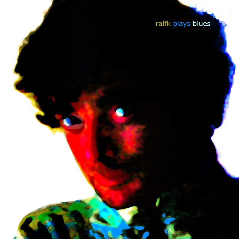
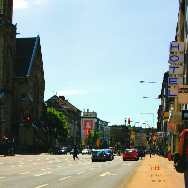
anyway, he asked me to design sleeves for these records, (the front side of) 3 of which i will put up here below, in this thread of posts showing what nowadays is within reach with photoshop for anyone, as compared to the pre-digital era. they are perhaps not my finest graphical designs, but i also like to promote ralf kwaaknijd a little bit, so...here!

ralfk plays blues, own work
ralfk plays blues (own work 2008, click on the image for an enlargement)

ralfk plays blues, own work
ralfk plays aachen (own work 2009, click on the image for an enlargement)

ralfk plays blues, own work
ralfk plays the street (own work 2010, click on the image for an enlargement)

[oh, i should talk a little about these designs of course...the first being a portrait of ralf as a blues musician, which he refused initially to put on the sleeve, but i managed to convince him that these blues needed a portrait, more specifically a portrait like this one.

the second design came out of ralf's wish to relate to the cover of `abbey road' by the beatles, but he refused to be recognizably in the picture (but he is there...cameo-wise you might say).

the third design is the latest, reflecting on the fact that ralfk started out as a street musician. then as well as now, he often performs at night when most people are asleep...yet the picture is not taken at night, it is a simple black&white reversal...but it works well i believe.]

Sunday, December 5, 2010

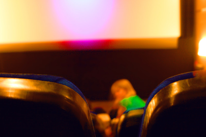
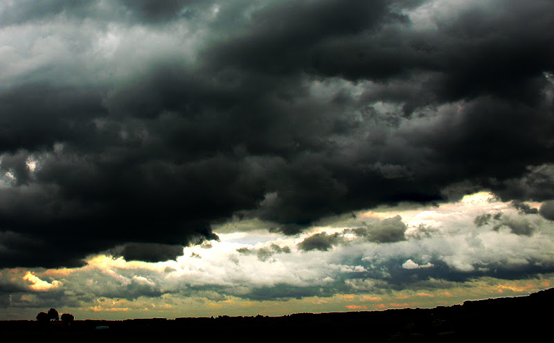
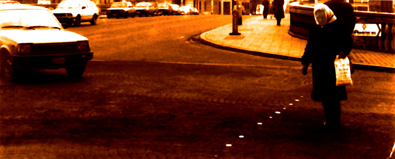
more digital stuff, mostly mildly photoshopped pictures (don't expect elaborate digital art)

cinema, own work
cinema (own work 2008-2010, click on the image for an enlargement)

dark sky, polder, own work
dark sky, polder (own work 2010, click on the image for an enlargement)

liège 1985, own work
liège 1985 (own work 2008, click on the image for an enlargement)

still life with kiwi, own work
still life with kiwi (own work 2008-2010, click on the image for an enlargement)

&&&&&&

anyway, one point is: without photoshop i would never have been able to make these pictures. the analog technology necessary for producing anything remotely resembling these pictures is way above my head. i'm not saying they are so great or anything, but photoshop at least has opened a world of photography for me, that was quite closed to me before.

and taking pictures, especially of landscape and nature, is also an inspiring way to prepare visually for painting and drawing.

[to be continued]

Sunday, November 28, 2010

digital self portrait 2 (& photoshop)

digital self portrait, own work
digital self portrait (own work 2008, click on the image for an enlargement)

[this is actually the picture i use for my profile on blogger...ok, i know it's a little over the top but...it's got something which is really me, too]

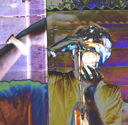
digital self portrait as a photographer, own work
digital self portrait as a photographer (own work 2007, click on the image for a slight enlargement)

you can see the heavy use of photoshop...but it opens new possibilities. i devote quite some energy towards photography...and it used to be impossible to get things right. but now in the digital age, i really achieve pictures that i wish to achieve. which is to me a true gift from our technical and ict-community, thank you all! i think i will put up some more of these digital pictures, to show what i'm talking about.

intermezzo: digital self portrait 1

digital self portrait, own work
digital self portrait (own work 2010, click on the image for an enlargement).

i know, no relation to the previous post. but i wish to write more frequently, and there are still quite some subjects to tackle, like the possibilities of photoshop. an artist can use up multiple lives trying to master all the techniques available nowadays. nonetheless, visual training, or perhaps more specifically artistic training of one's own eyes remains the most vital key to mastering any technique in any worthwhile way, i believe.

something to come back to: the incredible amount of time and energy which i believe to be necessary in order to gain artistic mastery...in contrast to the sometimes limited time necessary to create a work of art.

anyone can create a wonderful work of art, i believe. many many people can be an artist, i think. but the time and energy needed to achieve artistic mastery will only be sacrificed by comparatively few people. this doesn't mean that works of art created by others are less magnificent necessarily...just less magnificent statistically.

this does explain why i occasionally find myself in awe of some unknown work of art created by `a complete nobody' (not in my eyes, you understand). and i very much enjoy being awed in such fashion.

Friday, November 26, 2010

drawing, painting, drainting (st. frances 2)

portrait of st. frances drawing, drawing, own work
portrait of st. frances drawing, mixed media on paper (own work 2010, 20 x 30 cm, click on the image for an enlargement).

compared to the later work in the 20 november post, this one is more direct, less refined, but that is not to say less expressive. [disclaimer: drawings' colours and fine details are hard to photograph]

this drawing can also still be considered a drainting...but has more obvious drawing elements than (oh let me just repeat it, that is easier:) the later work below:

st. frances drawing, drawing, own work
st. frances drawing, mixed media on paper (own work 2010, 20 x 30 cm, click on the image for an enlargement).
$$$$$$$$

now to start a thread on the shady distinction between painting and drawing, first a wikipedia entry:
Drawing is a form of visual expression and is one of the major forms within the visual arts. There are a number of subcategories of drawing, including cartooning. Certain drawing methods or approaches, such as "doodling" and other informal kinds of drawing such as drawing on a foggy mirror caused by the steam from a shower, or the surrealist method of "entoptic graphomania", in which dots are made at the sites of impurities in a blank sheet of paper, and lines are then made between the dots, may or may not be considered as part of "drawing" as a "fine art." Likewise tracing, drawing on a thin piece of paper, sometimes designed for that purpose (tracing paper), around the outline of preexisting shapes that show through this paper, is also not considered fine art, although it may be part of the draughtsman's preparation.

The word 'drawing' is used as both a verb and a noun:

* Drawing (verb) is the act of making marks on a surface so as to create an image, form or shape.
* The produced image is also called a drawing (noun). A quick, unrefined drawing may be defined as a sketch.

Drawing is generally concerned with the marking of lines and areas of tone onto paper. Traditional drawings were monochrome, or at least had little colour,[1] while modern coloured-pencil drawings may approach or cross a boundary between drawing and painting. In Western terminology, however, drawing is distinct from painting despite that similar media are often employed in both tasks. Dry media, normally associated with drawing, such as chalk, may be used in pastel paintings. Drawing may be done with a liquid medium, applied with brushes or pens. Similar supports likewise can serve both: painting generally involves the application of liquid paint onto prepared canvas or panels, but sometimes an underdrawing is drawn first on that same support. Drawing is often exploratory, with considerable emphasis on observation, problem solving and composition. Drawing is also regularly employed in preparation for a painting, further obfuscating their distinction.

this entry already shows that the disciplines of drawing and painting are not so easily separated.

saatchi online: terms of endearment 2!

wow, i'm actually flabbergasted! saatchi online has changed its terms of use, on 19 november. very recently, and almost directly after i complained about it on this blog. (i also explained in my mail to them why i preferred deleting my account to accepting their terms, but this was a short explanation, and their reaction was non-committal).

their old terms:
License to User Submissions. You may submit content (including Works) for use and display on the Website ("User Submissions"). You grant Saatchi a non-exclusive, worldwide, perpetual, royalty-free, fully paid-up license to use, reproduce, create derivative works of, reformat, distribute, perform and display the User Submissions (in whole or part) and to incorporate the User Submissions in other works in any form, media, or technology now known or later developed (i) on the Website, (ii) in materials created to promote the Website and its contents, and (iii) in connection with online and offline events conducted in connection with the Website.

their new terms:
You retain ownership of all Content you submit to Saatchi via the Website. However, you grant Saatchi a non-exclusive, worldwide, royalty-free, license to publicly display and publicly perform your Content to make it available on the Website and to reproduce and reformat such Content only for the purpose of making the Content available on the Website.


in my older post on saatchi online i commented how they should narrow the terms of use in order to make them acceptable, and this is precisely what they have done.

[now a question remains (only due to my ego, i know): did this blog influence saatchi online? i really doubt this, on the other hand i received an anonymous comment on my previous post alerting me to the fact that saatchi online had changed their terms...well i suppose it's nice to dream that one can have some influence in this world, even as an insignificant artist...;-) thank you saatchi online!]

all in all good news. i will therefore go back to having an acccount on saatchi online only, now i have to mail them again to see if they can reinstate my account, without me having to upload all the texts and images again...

Saturday, November 20, 2010

some drawings of this year 2

some more drawings, without too much commentary (today, maybe i'll add something more later on).

[[repeated from a previous post: i'm always drawing...drawing to me is like poetry, and it is definitely a continuous source which pours over to painting. enough said, i'm just going to put up some pictures. (you can click on them for larger images.).

by the way, i invariably find drawings to be difficult to photograph well, my cameras nor my scanner are able to handle the contrasts and subtle whites and tonings that typically occur in a drawing. so although i put in quite some effort, the result is not as accurate as i would like it to be.]]

st. frances drawing, drawing, own work
st. frances drawing, mixed media on paper (own work 2010, 20 x 30 cm, click on the image for an enlargement).

[later comment 26 nov 2010:] this drawing is the latest in a series of st. francesca of rome (`st. frances drawing'). i worked on this drawing for 5 months, off and on. in fact, the word `drawing' becomes a bit questionable in many of my works on paper, because many of these works can also be seen as painting. perhaps the most accurate description would be `drainting' (since `pawing' has quite a different connotation already ;-)). let's google `drainting'! ...ok, having done so, as expected this observation and these puns have already been made by fellow artists...! but i will merit this discussion with another post. check out my posts for 26 november.


caught up in circles, drawing, own work
caught up in circles, mixed media on paper (own work 2010, 20 x 30 cm, click on the image for an enlargement) [from the lyrics of cyndi lauper's `time after time'].

[26 november:] i'm working on putting my figures in some space. spatiality never was my strongest point, and starting out i didn't consider spatiality to be very important. a bit like paul klee perhaps. nowadays i'm puzzling on the question whether to devote more energy on achieving spatiality, or to continue to search for spiritual expression through other means, or...a combination, which is perhaps impossible. my problem with spatiality is that it already confers a touch of realism, and realism -its merits notwithstanding- has the decided disadvantage of taking the state of being as its foundation. all art derived from realism actually does this. so perhaps almost art does this, and it is the distance to / distortion of reality that determines whether something is classified as `realistic'. however, the above drainting will not be considered realistic by most viewers. still, it is based on realism nonetheless.

the question also is: why not content oneself with the state of being as an artistic foundation? or even as a spiritual foundation? to me there is also some inner world -perhaps childlike, primitive,...primordial, primogenial,...; perhaps not- which strives for expression. by using spatiality techniques (from the strange endeavour of creating 2D-works representing (3D-elements of) a 3D-world) one already puts a large restraint on the expression.

anyway, this is a hard question for me, and i will not be able to provide any real answer, i'm afraid. `caught up in circles, confusion is nothing new' applies here too. a very nice song...`if you're lost you may look and you will find me, time after time // if you fall i will catch you, i'll be waiting...time after time'

caught up in circles, detail of drawing, own work
detail of the above drawing

Saturday, November 6, 2010

saatchi online: terms of endearment

i recently found out that my artist account on saatchi gallery's website was moved to something new called `saatchi online'.

when i tried to login and edit some of my works, i found i had to agree to the terms of use, including:
License to User Submissions. You may submit content (including Works) for use and display on the Website ("User Submissions"). You grant Saatchi a non-exclusive, worldwide, perpetual, royalty-free, fully paid-up license to use, reproduce, create derivative works of, reformat, distribute, perform and display the User Submissions (in whole or part) and to incorporate the User Submissions in other works in any form, media, or technology now known or later developed (i) on the Website, (ii) in materials created to promote the Website and its contents, and (iii) in connection with online and offline events conducted in connection with the Website.

i was not in the best of moods (something that is statistically linked with being an artist, science tells us...;-)) and i suddenly rebelled. i don't recall having agreed to similar terms when i signed up for my original account. so, without my knowledge and without my consent, my works have been transferred to a new site, AND hidden in the terms of use, i suddenly have to grant saatchi a very broad license of use of my works.

i emailed saatchi online, and their only solution on offer was to cancel my account. an offer which i took, so you will no longer find my page there.

however, in the meantime, the saatchi gallery site has attracted tons of links from artists like me, and these links are perhaps an important factor in its having become a high-ranked site (i don't know this for sure).

i really don't understand why a gallery like saatchi needs to treat artists in this way. i used to be really enthusiastic about their initiative to give artists from all over the world a web page. (i was naturally skeptic with regard to their showdown competition, but you know, competition is mankind's paradise...). but this gives me a bad taste. it breathes disrespect for the artist. the artist has become like a goat in a flock: economical asset, to be herded in the right direction but not to be wasted too much time on (for instance when permission could simply be asked individually, for specific occasions, to use my works...no, i have to grant this permission for all future occasions, not knowing in the least what these occasions might be).

you might think i'm being a stickler, but please read the terms very carefully, and you will see that they are broader than the hangar doors of a large aircraft. if they were a bit more narrow, i could perhaps live with them.

anyway, i hope saatchi online will reconsider (but you know how it is with goats...a few strays generally don't bother the cattle magnate!) but for now i have to conclude that i cannot support their initiative any longer.

Monday, November 1, 2010

munch, van dongen and realism in rotterdam

lately i went to see two exhibitions in rotterdam: works of edvard munch in the kunsthal and works of kees van dongen in museum boymans van beuningen. the two museums are a walking distance apart, so the combination is not that hard.

however, the exhibitions themselves were mostly a disappointment. and expensive to visit too.

i counted 5 or 6 paintings by van dongen that for me showed real artistic merit. and only 2 paintings by munch with the same qualification.

of course, museums benefit from large visitor numbers. which is one reason why they produce endless laudations on the artists they show. it is all marvellous, unique and wonderful...but to the experienced eye, many artists have better works and lesser works, and better periods and lesser periods even.

what is on show in rotterdam at the moment is hopefully not truly considered as the better works of van dongen and munch...

$$$$$$$$$

far more interesting was the exhibition `international realism' at the kunsthal. although i'm not a fan of realism per se, this exhibition was thoughtfully put together, with many interesting works from a very diverse range of artists.

Tuesday, September 7, 2010

modest exhibition in Hogeschool Arnhem Nijmegen

clouds-over-cornfield_s.jpg
clouds over cornfield, 2010 (50 x 152 cm)


exhibition of paintings

1 september t/m 28 feb 2011

hogeschool arnhem nijmegen
kapittelweg 33 nijmegen
gang C.00

dear all,

the next 6 months i will show 15 paintings in hallway C.00 of the HANbuilding on the kapittelweg, nijmegen, 5 minutes walking from station nijmegen heijendaal. mostly recent work, 6 paintings have not been shown earlier.

you are welcome to take a look at this modest exhibition.

more info on my website www.fwaaldijk.nl

Monday, July 12, 2010

some drawings of this year 1

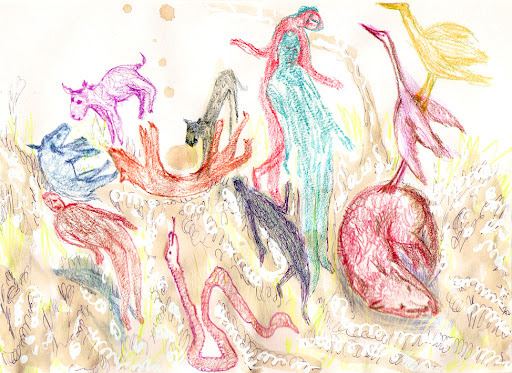
i'm always drawing. but drawing remains an undervalued art form. invariably, for exhibitions, paintings and sculptures are favoured. still, drawing to me is like poetry, and it is definitely a continuous source which pours over to painting. enough said, i'm just going to put up some pictures. (you can click on them for larger images.).

by the way, i invariably find drawings to be difficult to photograph well, my cameras nor my scanner are able to handle the contrasts and subtle whites and tonings that typically occur in a drawing. so although i put in quite some effort, the result is not as accurate as i would like it to be.

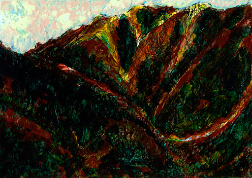
la gomera, drawing, own work
la gomera, mixed media on paper (own work 2010, 20 x 30 cm, click on the image for an enlargement).

vision of st. francis, drawing, own work
vision of st. francis, mixed media on paper (own work 2010, 20 x 30 cm, click on the image for an enlargement).

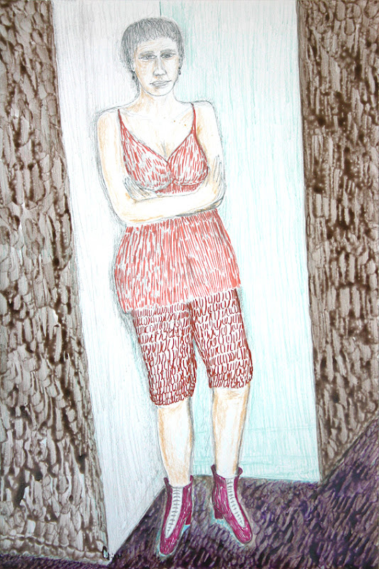
i found my love in a corner, drawing, own work
i found my love in a corner, waiting -though we did not know it at the time- for me, mixed media on paper (own work 2010, 40 x 30 cm, click on the image for an enlargement).

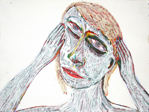
here i stand head in hands, drawing, own work
here i stand, head in hands, mixed media on paper (own work 2010, 30 x 38 cm, click on the image for an enlargement).

taking care of the psychiatric patient 1, drawing, own work
taking care of the psychiatric patient 1, mixed media on paper (own work 2010, 30 x 40 cm, click on the image for an enlargement, i'm not satisfied with this reproduction's colours).

taking care of the psychiatric patient 2, drawing, own work
taking care of the psychiatric patient 2, mixed media on paper(own work 2010, 30 x 40 cm, click on the image for an enlargement, i'm not satisfied with this reproduction's colours).

the false guru and his Divine Energy, drawing, own work 2010)
the false guru and his Divine Energy, mixed media on paper (own work 2010, 15 x 10 cm, click on the image for an enlargement).

self-portrait as you crying over me, drawing, own work
self-portrait as you, crying over me, mixed media on paper (own work 2010, 30 x 40 cm, click on the image for an enlargement).

self-portrait cruising down the styx, drawing, own work
self-portrait cruising down the styx, mixed media on paper (own work 2010, 30 x 40 cm, click on the image for an enlargement).

not all art is conceptual

oh very well, so i was wrong. i should have said `all referential art is conceptual' or something like that. or (anyway, most interestingly): `all figurative art is conceptual'.

and still that would miss the mark of accuracy, since a substantial part of art is about the direct (mostly visual) experience. which is not always referential i believe (although there might be scientific debate on how much referential activity goes on in the brain when looking at art), and indeed there is in our time quite some art which is completely about the direct experience. one could call this experiental art, let me look up this term to see if it has been coined already.

so it would be perhaps not so interesting but more accurate to say:


most figurative art
has a large
conceptual component


but this type of statement obviously has far less appeal than postmodernized statements like:


not all art
is conceptual
(but this is)


anyway, to continue where the previous post left off, why coin the term `conceptual art'? this term is generally reserved for art which is mainly conceptual, meaning that visual referentiality, artistry & craftmanship play a lesser role than in other art.

in the most extreme cases, the conceptual artwork is not even physically realized, other than as a description of a physical possibility (perhaps even impossibility).

as an example, below ralf kwaaknijd's conceptual artwork `touch mahal':

`A large army transport-helicopter filled with crude oil flies above the Taj Mahal, and spills the oil on the white dome. Riots break out, the clean-up is lengthy and difficult.'

kwaaknijd himself says: "This artwork targets the vise of religion & capitalism in which the world is held, ultimately leading to strife, war, poverty and global pollution. Black-and-white thinking blocks any serious effort to address these global problems. And we are content to let the status quo continue, until some catastrophy forces us to act."

For some other interesting examples you might want to check out Monochrom (or not, then sorry!).

Wednesday, June 30, 2010

all art is conceptual

once again (like in `conceptual art vs. beauty') the title says it all. but my students still liked me to explain what i mean with:


all art is conceptual


oh very well. i'll try to explain what i mean, even though the nature of the postmodern fashion of vagueness and quasi-profundity is such that one doesn't of course explain anything about quasi-profound statements, one just adds to them with new quasi-profound commentaries. once again i forsake my chances of ever becoming a successful postmodernist ;-)

so why is all art conceptual, imnsho? because, as i see it, any art work references our human existence, our human experience, our human views and emotions, our human maps of reality and fantasy and ...

in other words, as wittgenstein pointed out so obviously and yet so beautifully in his tractatus logico-philosophicus:


wir machen uns

bilder der welt


literally translated: we create for ourselves images of the world. the meaning is to me, that any image that we create of the world, is by necessity a conceptual reference. it is a map, pointing to something in the real world, the direct world (like the direct beauty i talked about in the previous post). somehow we humans have the capacity AND yearning for developing references, communicating such references, analyzing references etcetera. you could say there is a fair risk that we spend most of our times poring over our maps of our worlds...and forget to go out and experience these worlds directly.

therefore to me, what distinguishes art from nature is its referential character. precisely this referential character is what makes all art conceptual. so why coin the phrase `conceptual art'?

(to be continued in the next post)

Tuesday, June 29, 2010

hard-won beauty, direct beauty, conceptual beauty

so, let's forget a moment about conceptual art...even though all art in a way is conceptual imnsho (in my not so humble opinion), which i'll comment on later.

more interesting perhaps to talk about hard-won beauty.

why not simply beauty, why this `hard-won' adjective?

to me, it is what distinguishes great art. when i'm walking in the forest, i come across all sorts of plants and trees which i find utterly beautiful and amazing. daily, i see people whom i consider very beautiful, each in their own way. i find many beautiful wonders in this world, all created by nature. zebras, swans, snakes, you name it. the sea, the forest, rolling grassy hills, the sun, the stars,...

and i would not trade this type of direct beauty for all of the world's greatest art works. but still, these (what i consider great) art works do have something special, something that their makers have worked extremely hard for, a different type of beauty...perhaps i should call it conceptual beauty, because these art works refer to our very deepest concept of beauty.

and other emotions as well.

anyway, here below a most remarkable painting which i consider to fulfill all of the above:

salvador dalí, christ of st. john of the cross
salvador dalí, christ of st. john of the cross (click on the image for an enlargement).

perhaps i will discuss it a little bit in the next post.

Monday, June 28, 2010

conceptual art vs. beauty 3

it is easier to criticize than to create, i believe. but since i am an artist myself, creating is not my problem, although it can be arduous and painstaking at times.

still, criticizing other artists is not my favourite pastime. i prefer to criticize museums, galleries, popular media, society, god, the world, the moon, the climate, my family (in private), etc...

even when i do not really appreciate a work of art, usually i try to find some merit in whatever effort has been made by the artist. but also i have these recurrent episodes where i berate myself for being altogether too soft and clement, and i find this to especially occur when i have seen yet another `great' work of conceptual art in which the contemporary art scene is being ridiculed or in which some other shallow message is being heralded as the ultimate in the artistic development of man...

and my god, these conceptual people are everywhere! perhaps not so amazing, since any halfwitted primate can come up with some superficial `shocking!' `mocking!' `rocking!' concept the depth of which leaves us all agape! like having a gallerist walk around for a month in a costume resembling a penis...well, NOW we're talking art!

oh no, frank, you misunderstand. it's not a teenage prank, it is a criticism of the fact that the modern art world is ruled by teenage pranksters....so you see it's much deeper than it might seem, and you have to see his whole oeuvre, which is all absurdistic and criticizing and well, so FUNNY!

actually i don't mind humor one bit...but does one classify the superficial jokes of a stand-up comedian as great literature? i KNOW that stand-up comedians are more appreciated than great literature, and i even do not criticize this, but i do mind if the library starts to get filled with the collected jokes of john howards and howard johns and...to the extent where i cannot get a real modern writer any longer.

and this is what is happening in my perception in the art world. conceptual art is an easy way to facilitate the take-over of art by entertainment. i like entertainment to a liberal extent, but i dislike entertainment being more important than real issues.

now i remember that i made two conceptual sculptures which probably would illustrate some of my point (i'm working on numbers 3 and 4, but i've been at them for 3 years now and they still aren't anywhere near completion). perhaps i'll put them up in the next post.
conceptual art vs. beauty 2

ok, i admit it, the previous post was another cheap stab at conceptual art. yet the title does say it all, doesn't it?

the thing is, i'm feeling overbombarded with conceptual art lately. and too much of too much seldom does much for me. another issue that i'm having with conceptual art lately is that it really is all too easy to create something with a superficially semi-DEEP MEANING, if you know what i mean...and i'm just bored with all this DEEP MEANING stuff.

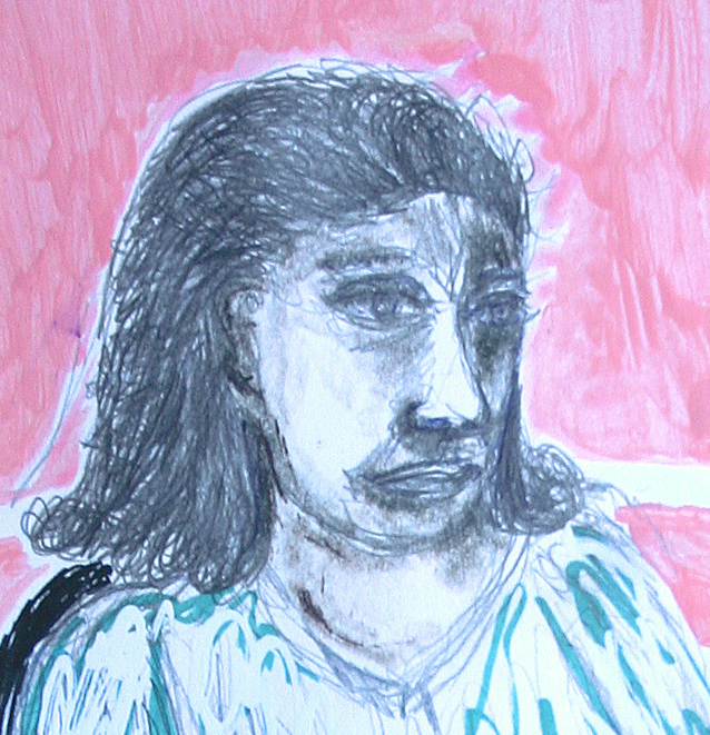
still, I'm also bored with all the meaningless postmodern vagueness that seems to be another vogue these days. one sees a face, painted with dripping paint. it is a face of a young woman, but there is no real expression, because it's really only a double set of lines, executed in paint, yielding an unclear double image. the artist shows (s)he can hold a brush, follow a smooth curve with them, and let the paint drip down a bit...and still create the suggestion of a face...well, all very nice and technically up-to-standard i suppose, but what is it about? why should i spend time looking at it?

neither of the above vogues (conceptual art and postmodern vagueness) seem to care much for hard-won beauty. by hard-won beauty, i suppose i largely mean what robert pirsig calls quality. but let's call it hard-won beauty for a change.

hard-won beauty in a painted or drawn face...what does that mean to me, then? stuff for the following post.

Wednesday, June 23, 2010

warning! conceptual artwork below:


conceptual art

vs.

beauty


Saturday, March 6, 2010

small exhibition in central library of nijmegen

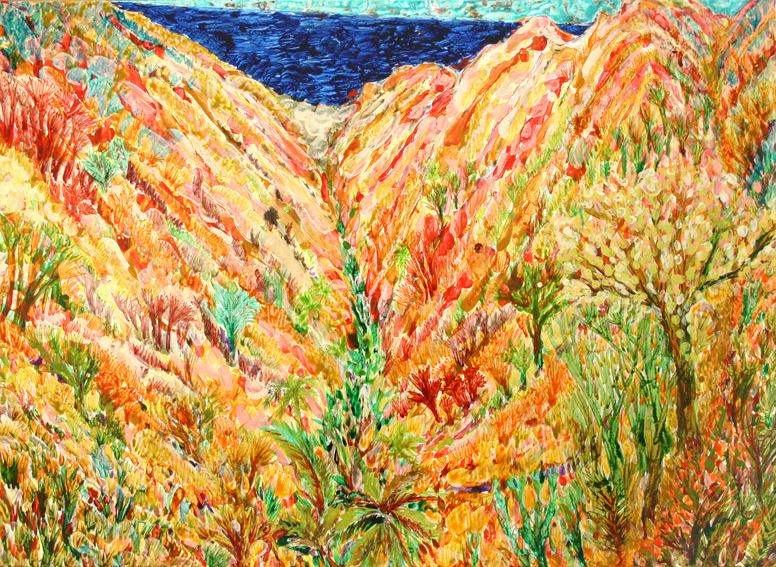
la gomera (2009 ~ 80 x 110 cm ~ acrylic and ink on canvas)
la gomera
(2009 ~ 80 x 110 cm ~ acrylic and ink on canvas)

i'm having a small exhibition in the central library of nijmegen. this, plus teaching art at the unit-academy in nijmegen and writing a blog about that as well, plus flu...have kept me from posting here.

anyway, here is an invitation, welcome all:

1-31 march 2010

paintings & sculptures

central library nijmegen

mariënburg 29 nijmegen

opening hours:

monday 11.00 - 18.00
tuesday 11.00 - 21.00
wednesday 11.00 - 18.00
thursday 11.00 - 21.00
friday 11.00 - 21.00
saturday 10.00 - 17.00
sunday
13.00 - 17.00